Preview image. Unlock full-res
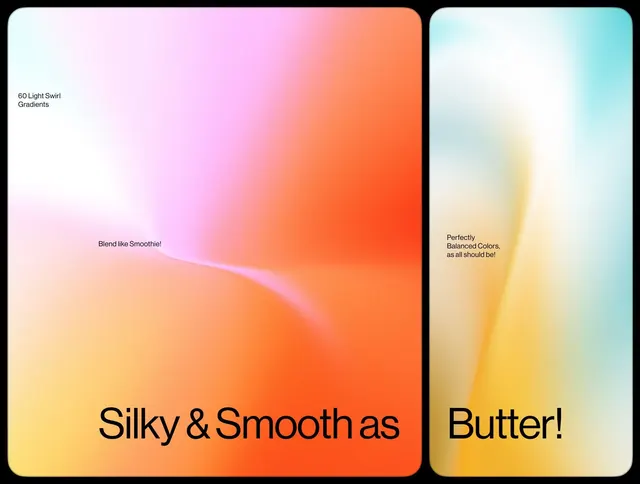
Two-panel gradient study showcasing smooth color transitions from pastels to warm tones, with playful product-style callouts.
Summary
Two rounded-rectangle panels each showcasing a smooth gradient transition, paired to demonstrate color harmony and blending techniques in soft, product-oriented styling.
Visual description
Left panel: gentle gradient flowing from white at top-left through pale pink and warm coral to deep burnt orange at bottom-right, with a soft pink curved swirl dividing upper and lower zones. The label "60 Light Swirl Gradients" sits at top-left in dark sans-serif; center text reads "Blend like Smoothie!" in organic script-adjacent type. Right panel: pale cyan-to-white transition at top dissolving into pale yellow-to-cream zones, with a centered callout reading "Perfectly Balanced Colors, as all should be!" in neutral sans-serif. Both panels are set on a black background with rounded corners, creating a product-showcase aesthetic. The text treatments emphasize the smoothness of the color transitions.
Key takeaway
The use of a curved dividing line (swirl) as a visual separator that feels organic rather than geometric. The paired-panel comparison format effectively shows color behavior in two different harmony zones. The scale and positioning of overlaid text keeps it readable without competing with the gradient fields themselves.
Reuse notes
Perfect as a reference for gradient exploration, cosmetics or beauty product branding, or UI backgrounds that need visual softness without harshness. The dual-panel layout works well for before/after, light/dark, or concept-comparison mockups. Not suitable for high-contrast accessibility requirements.
More like this


Keep what you find
A free account saves references to boards and can send you a weekly email of picks based on what you save.
To see every result, go Pro.