Preview image. Unlock full-res
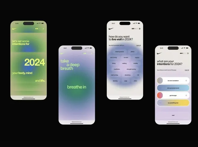
Mobile app UI screens for a wellness intention-setting app featuring soft gradient backgrounds, accessible color-coding, and conversational prompts.
Summary
Mobile app UI screens for a wellness intention-setting app featuring soft gradient backgrounds, accessible color-coding, and conversational prompts.
Visual description
Four iPhone mockups on a black background display an onboarding or goal-setting flow. Left screen: green-to-blue gradient with "2024" large and "your body, mind, and life" in smaller text. Second screen: purple-to-teal gradient with "take a deep breath" and "breathe in" stacked phrases. Third screen: blue-to-cool-purple gradient with question "How do you want to live well in 2024?" and a grid of accessible intention tags (self-care, mindful, etc.) in muted tones. Right screen: color-picker sidebar with circular swatches (soft greens, pinks, yellows, purples) and text input area. Consistent typography, clear hierarchy, generous spacing.
Key takeaway
The gradient color strategy creates emotional warmth while maintaining accessibility. Soft, muted color swatches in the picker avoid oversaturation while offering choice. The conversational prompt structure ("take a deep breath") humanizes the experience. Multi-screen layout showing progression guides users through a narrative flow.
Reuse notes
Excellent model for wellness, mental-health, or habit-tracking apps. The gradient-plus-muted-palette combination is calming and modern. The accessible color chips and readable type support users of varying abilities. Works for onboarding flows, goal-setting, or daily-intention interfaces. Nike's branding integrates subtly, so customize per your brand while maintaining the calm aesthetic.
More like this


Keep what you find
A free account saves references to boards and can send you a weekly email of picks based on what you save.
To see every result, go Pro.