Preview image. Unlock full-res
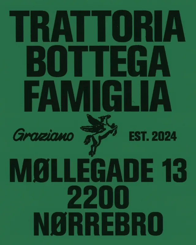
Italian family trattoria branding with stacked display typography in heavy sans-serif and a hand-drawn courier angel icon on olive green.
Summary
Stacked Italian restaurant branding using heavy display type and a hand-drawn courier angel mark, establishing a family-run, traditional food-service identity.
Visual description
Deep olive-green background with tightly letter-spaced, all-caps display typography stacked vertically: "TRATTORIA", "BOTTEGA", "FAMIGLIA". Below, a hand-drawn courier angel icon in black ink. Secondary text in script and sans-serif reads "Graziano" (left) and "EST. 2024" (right), anchoring the establishment date. At bottom, address text "MØLLEGADE 13 2200 NØRREBRO" in condensed sans-serif. All type is solid black; the green background provides isolation and a heritage feel. Composition is centered and balanced vertically.
Key takeaway
The hand-drawn icon as a geometric anchor point breaking up wall-of-type. The tight tracking on display letterforms and the script/sans-serif hierarchy creating three weight layers (headlines, mark, metadata). Olive green as an alternative to black/white for heritage food branding.
Reuse notes
Works for family-run restaurants, local food service, or craft producers wanting a nostalgic, artisanal feel. The hand-drawn courier adds personality without clashing with formal type. Pair with serif or script for secondary copy to soften the heavy geometric display.
More like this

Keep what you find
A free account saves references to boards and can send you a weekly email of picks based on what you save.
To see every result, go Pro.