Preview image. Unlock full-res
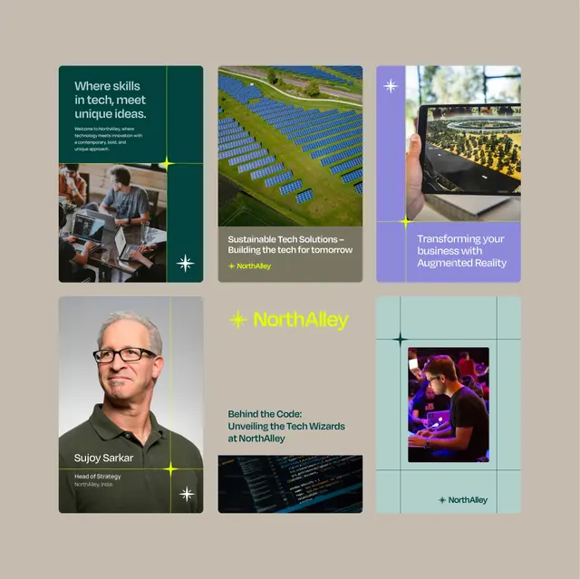
A modular grid showcasing tech innovation, paired photography, and strategic messaging for a software/AR company.
Summary
A modular grid layout showcasing tech innovation, paired photography, and strategic messaging for a software and AR company.
Visual description
A 3x3 grid of boxes on a neutral tan background displaying NorthAlley's business offering. Top-left holds a teal card with white headline text ("Where skills in tech, meet unique ideas"), followed by smaller subtext and a photo of two colleagues at a desk. Top-center shows an aerial photograph of solar panels with an overlaid caption "Sustainable Tech Solutions - Building the tech for tomorrow." Top-right is a lavender box with a plus icon and the text "Transforming your business with Augmented Reality," anchoring an industrial AR device photo. Middle-left is a portrait of "Sujoy Sarkar, Head of Strategy" with his headshot and title on a dark olive background with white accent marks. Center displays "NorthAlley" in bright yellow sans-serif type. Middle-center shows a code snippet on dark background. Bottom-right holds a mint-green box with a plus icon and a vibrant photo of a person wearing AR equipment. All boxes use white accent marks (plus signs, star motifs) as visual punctuation. Typography is clean, uppercase-heavy sans-serif; color palette emphasizes teal, olive, lavender, mint, and neutral tones.
Key takeaway
The grid structure that compartmentalizes distinct business narratives (team, sustainability, AR capability) while maintaining visual cohesion through consistent accent marks, type scale, and a unified color story. The play between photography (portraits, industrial, tech) and flat color blocks creates rhythm and prevents monotony in an information-dense layout.
Reuse notes
Works well for B2B tech company case studies, capability overviews, or team introductions. The modular grid accepts variable content (images, copy, profiles) without breaking. Best when paired with photographic assets that show people, infrastructure, or product in context. Avoid overstuffing the grid; white space is key.
More like this






Keep what you find
A free account saves references to boards and can send you a weekly email of picks based on what you save.
To see every result, go Pro.