Preview image. Unlock full-res
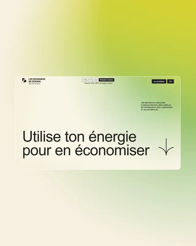
Minimal French-language poster for energy conservation with soft lime-to-cream gradient background and centered sans-serif type.
Summary
A minimal sustainability poster using a soft lime-green-to-cream gradient with centered French text about energy conservation.
Visual description
Full vertical poster with a smooth radial gradient transitioning from warm lime-green at top-right to soft cream at bottom-left. French headline "Utilise ton énergie pour en économiser" (Use your energy to save it) in a bold, modern sans-serif typeface, positioned center-left in dark gray or black. A small downward arrow appears below the text. Subtle branding elements visible at the top left, with minimal additional information. The overall composition is uncluttered, relying entirely on color gradient and type hierarchy.
Key takeaway
The soft analogous color gradient (warm yellow-green range) creates visual warmth without garishness; perfect for messaging about energy and sustainability. The centered text with a single supporting graphic element (arrow) demonstrates how minimal hierarchy works at scale. The French language adds cultural specificity without requiring localization complexity.
Reuse notes
Strong reference for nonprofit sustainability campaigns, public service announcements, or eco-conscious brand posters. Works well as a landing page hero or printed collateral. Gradient pairs nicely with rounded sans-serifs and feels contemporary without trendy. Best suited for messaging about efficiency, conservation, or environmental action.
More like this




Keep what you find
A free account saves references to boards and can send you a weekly email of picks based on what you save.
To see every result, go Pro.