Preview image. Unlock full-res
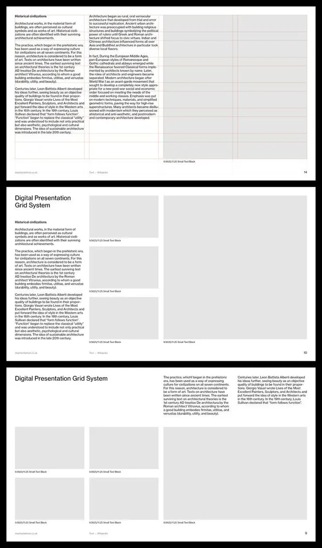
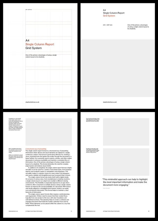
A multi-page design system documentation showing three modular grid layouts for presentations, with placeholder content blocks and consistent spacing rules.
Summary
A three-page presentation showing grid-based layout templates with columns, content placeholders, and measured typography scales for systematic design guidance.
Visual description
Three full pages of design system documentation on white backgrounds with black typography and light gray placeholder blocks. Each page demonstrates a distinct layout composition. Page 1: a two-column layout with flush-left body text occupying one third of the width, and tall rectangular placeholders in the remaining two-thirds, labeled "S Rosch/235 Small Text Block" at baseline. Page 2: titled "Digital Presentation Grid System" at top, repeating the two-column text-left plus placeholder-right pattern across three stacked examples, each labeled with the same placeholder nomenclature. Page 3: wider layout with large "Digital Presentation Grid System" heading spanning full width, body text column at left, then a series of six rectangular placeholder blocks arranged in a two-column, three-row grid on the right. All typography is uniform sans-serif, rendered in black or dark gray; all spacers and gutters are generous and consistent. Footer labels and small text appear in reduced weight. The system demonstrates flexibility through repeated application of the same grid structure with varying content proportions.
Key takeaway
The method of showing layout rules through labeled placeholder blocks rather than dummy copy emphasizes structure over content. A rigid modular grid applied consistently across multiple page layouts builds confidence in flexibility and reusability. Small footer metadata (page numbers, font names, measurements) acts as a stylistic flourish that signifies design-system rigor. The two-column text-right/content-left bias is a classic for documentation.
Reuse notes
Essential reference for creating presentation templates, pitch decks, or company brand guidelines. The wireframe approach works for design-system specification and onboarding new team members. Pair with actual brand type and imagery to make it a live template. Not suited to narrative or story-driven content; this is pure structure. Best when accompanied by a design documentation specification (font metrics, color values, grid dimensions in actual units).
More like this


Keep what you find
A free account saves references to boards and can send you a weekly email of picks based on what you save.
To see every result, go Pro.