Preview image. Unlock full-res
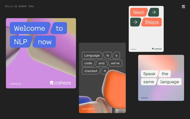
NLP educational software interface with soft pastel gradient cards, rounded button chips, and step-by-step navigation tiles on a dark background.
Summary
Coheze NLP interface showing a "Welcome to NLP now" splash with lavender-to-pink gradient overlaid on a soft photography sample, plus three adjacent interface cards with language-analysis terminology and soft-ui button modules.
Visual description
Dark gray background (nearly black) containing four key elements. Left: a large rounded card with a soft-focus gradient background (lavender to pink to peach) overlaid with blue and orange rounded-rectangle badges containing text "Welcome to NLP now" and the Coheze branding mark. Center-right: a tall cream or pale card with dark small text ("Language is a code and we've cracked it") segmented into rounded chip buttons, each in a pale neutral tone. Below center: a large rounded card with a peach-orange 3D object (perhaps a rounded cube or blob shape) suggesting dimensionality. Far right: another tall pale card with a lavender-to-pink soft gradient background, white and lavender text reading "Speak the same language" with matching button chips below. A "Next" orange button with an arrow sits in the top right corner. All cards feature heavily rounded corners, soft drop shadows, and pastel or saturated but gentle color palettes.
Key takeaway
Soft gradient cards as a friendliness signal on a dark canvas; the pastels and soft edges soften what could be stark. Chunked text segmented into button-like pill shapes makes dense information readable without sentences. Mixing photography, gradients, and 3D elements in separate cards creates visual interest without chaos. The color palette (lavender, coral, peach, deep blue accents) is cohesive and feels contemporary/approachable.
Reuse notes
Excellent for educational SaaS, data tools, AI/ML interfaces, or anything needing to feel "smart but not intimidating." The soft gradient and rounded corners are essential; this style reads as inclusive and modern. Works well for onboarding flows, tool introductions, or progressive-disclosure UIs where each card advances the narrative. Best paired with dark backgrounds to make pastels pop; avoid on white or light backgrounds where the softness disappears.
More like this

Keep what you find
A free account saves references to boards and can send you a weekly email of picks based on what you save.
To see every result, go Pro.