Preview image. Unlock full-res
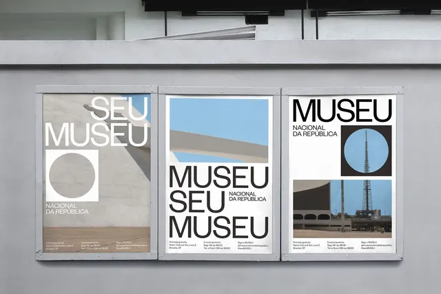
Modular institutional poster series for museum exhibition using bold sans-serif, geometric circles, and photographic documentation in high-contrast monochrome.
Summary
Modular institutional poster series for museum exhibition using bold sans-serif, geometric circles, and photographic documentation in high-contrast monochrome.
Visual description
Three identical aluminum-framed poster panels mounted side by side on a gray institutional wall. Each panel measures roughly the same size and uses the same typographic and color system. Left panel features white sans-serif text reading "SEU MUSEU" stacked vertically with "NACIONAL DA REPUBLICA" below, overlaid on a warm tan architectural photograph. A simple white circle sits in the lower left of the text block. Center panel is dominated by a bright sky-blue rectangle occupying the upper half, with geometric documentation imagery of what appears to be a architectural structure shot through a circular frame and a broader ground-level view below. Right panel mirrors the left, with "MUSEU SEU MUSEU NACIONAL DA REPUBLICA" as white stacked text in bold display typeface, accompanied by the same geometric circle and matching architectural photography. All panels share consistent spacing, type alignment, and minimal typographic color palette: black type, white text, gray background, single bright blue accent. Small footer text at bottom lists exhibition details and dates.
Key takeaway
The repeatable three-element grid (image, circle, text block) that maintains visual consistency across panels while accommodating different photographic content. The single bright color (sky blue) as an accent breaks the monochromatic scheme without competing. Large caps sans-serif for institutional signage, with the circle as a simple geometric mark adding rhythm.
Reuse notes
Ideal for museum, cultural institution, and public-sector communications. The modular approach allows flexibility in content while maintaining brand consistency. The high-contrast black-and-white-and-blue palette ensures legibility at large format. Works especially well for multi-location announcements or series campaigns where panels will hang together.
More like this



Keep what you find
A free account saves references to boards and can send you a weekly email of picks based on what you save.
To see every result, go Pro.