Preview image. Unlock full-res
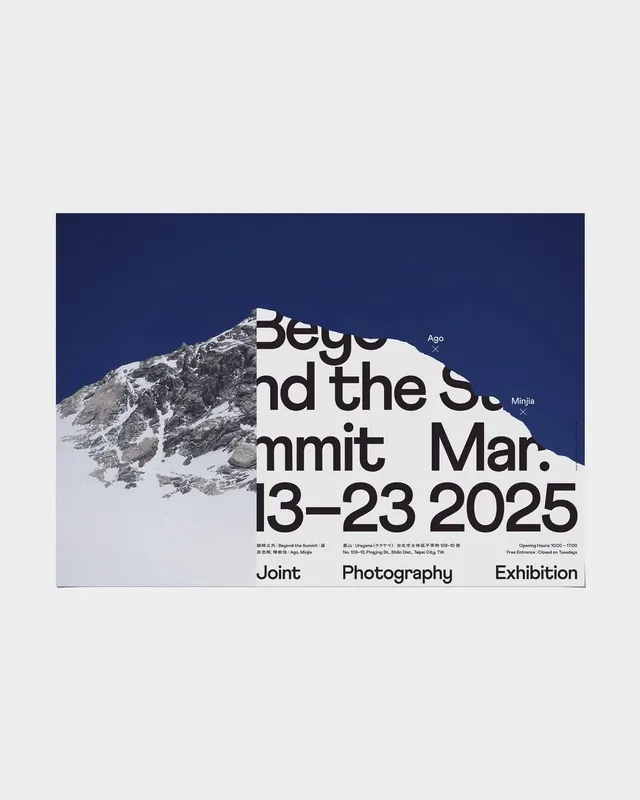
Exhibition poster featuring a snow-covered peak photograph as a cutout mask behind oversized sans-serif typography announcing an outdoor photography event.
Summary
Exhibition poster masking a sharp mountain photograph behind bold sans-serif typography announcing a joint photography exhibition, using navy blue background with white text for maximum impact.
Visual description
The composition is split vertically. A snow-capped mountain photograph occupies the right half, cropped to show the peak and upper slopes in sharp detail. Overlaid directly on the photograph is large-scale sans-serif typography in white (font weight: bold or extra-bold) announcing "Beyond the S... mmit" and the date "13-23 2025" with supporting location and event details in smaller caps below. The left half is solid deep navy blue (#202C5B) with supporting event information and metadata positioned in small grey typography. At the bottom, three parallel lines separate the poster into thirds horizontally. The overall aesthetic is editorial and austere, emphasizing typography and the raw beauty of the landscape without decoration. The white text creates maximum contrast against both the dark blue background and the white mountain slopes.
Key takeaway
The mask technique of overlaying bold typography directly over photography creates visual drama and directs attention to specific compositional areas. Using white type on both dark and light backgrounds (the photo's white snow) requires careful letter spacing and weight selection but pays off in a unified, striking design. The decision to leave the blue section typographically dense while letting the photograph breathe creates visual balance despite the imbalanced color split.
Reuse notes
Highly effective for exhibition posters, event promotion, and documentary or editorial work. Works best with strong landscape or architectural photography that can withstand being masked by large typography. The high-contrast palette limits color options; adapt this approach with other color pairs only if the contrast level can be maintained. Less suitable for festive or playful events; best suited to serious, professional, or artistic contexts.
More like this



Keep what you find
A free account saves references to boards and can send you a weekly email of picks based on what you save.
To see every result, go Pro.