Preview image. Unlock full-res
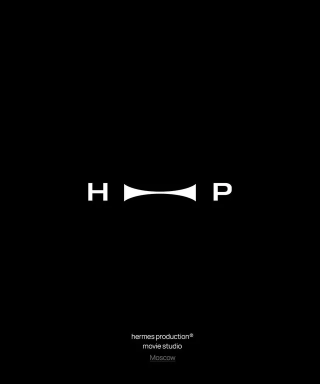
Minimalist white wordmark logo for a film production company, featuring H and P letterforms around a stylized bowtie symbol on a pure black ground.
Summary
Minimalist white wordmark logo for a film production company, featuring H and P letterforms around a stylized bowtie symbol on a pure black ground.
Visual description
A high-contrast monochromatic logo composition on a solid black background. White sans-serif letterforms H and P flank a central stylized bowtie or hourglass shape, also in white, creating a unified wordmark. Below the main mark, flush left, sits stacked text in a lighter sans-serif: "hermes production", an underlined "movie studio", and "Moscow" in a subdued gray. The design is symmetrical and mathematically precise, with the bowtie symbol serving as both a visual anchor and a thematic reference to formal attire and entertainment. The purity of black and white creates maximum contrast and elegant simplicity.
Key takeaway
The bowtie as a central visual metaphor works for entertainment and film production, suggesting both formality and a sense of play. The symmetrical letter-symbol-letter arrangement feels balanced and memorable. Using pure black and white eliminates any distraction and lets the letterforms and icon do all the communicative work. The hierarchical type treatment below (brand name, descriptor, location) provides context without visual clutter.
Reuse notes
Strong template for media, entertainment, and film production companies. The monochromatic approach is timeless and works across all media (business cards, signage, digital). The bowtie motif specifically signals entertainment or luxury brands. The layout can be adapted for different company names while maintaining the symmetrical icon-between-letters principle.
More like this




Keep what you find
A free account saves references to boards and can send you a weekly email of picks based on what you save.
To see every result, go Pro.