Preview image. Unlock full-res
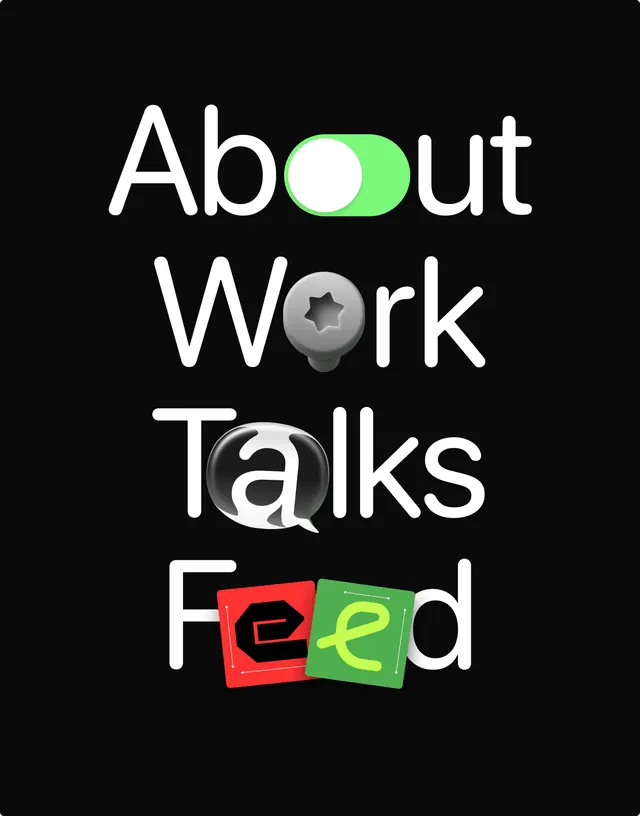
Typographic design stacking four lines of large white sans-serif headlines with playful icon-badges interrupting the text.
Summary
Typographic design stacking four lines of large white sans-serif headlines with playful icon-badges interrupting the text in green, grey, and red.
Visual description
Four left-aligned headline words in bold, extended sans-serif (roughly 120pt) sit on a pure black background, spaced vertically. The words "About", "Work", "Talks", and "Feed" each contain an embedded icon-badge: a bright lime-green rounded rectangle with a white dot for "About", a grey sphere with a star cutout for "Work", a speech-bubble button for "Talks", and a pair of tilted square cards in red and green for "Feed". Each badge is cut from the letterform itself, creating a modular, playful quality. The composition balances geometric precision with human scale.
Key takeaway
The badge-cutout technique: letting icons and color blocks fragment the headline creates visual interest without breaking the word. The bright green on black reads as premium and contemporary. The grid-aligned vertical stack makes the design feel both casual and controlled, ideal for podcast or content branding.
Reuse notes
Works well for media, podcast, or talk-show branding where personality matters. The stacked hierarchy is copy-friendly and scales cleanly. Avoid cramming too much text; this thrives on clear, short labels. The green accent pairs naturally with dark-mode websites.
More like this

Keep what you find
A free account saves references to boards and can send you a weekly email of picks based on what you save.
To see every result, go Pro.