Preview image. Unlock full-res
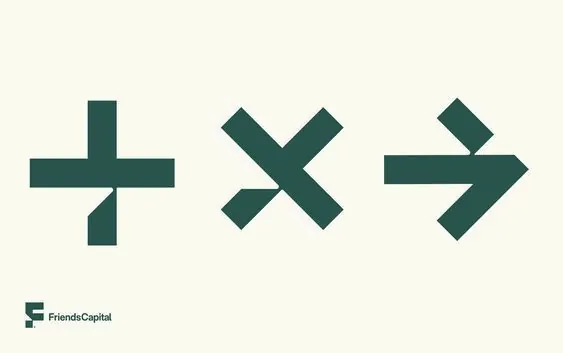
Three teal geometric symbols (plus, multiply, arrow) representing financial operations for a fintech brand, set on a warm beige background.
Summary
Three teal geometric symbols (plus, multiply, arrow) representing financial operations for a fintech brand, set on a warm beige background.
Visual description
Three clean, solid-teal icons arranged horizontally across a soft beige ground. From left to right: a plus/cross symbol, a multiply/X symbol, and a right-pointing arrow. Each icon is constructed from thick geometric strokes with sharp edges and negative space integration. Below the icons sits a small dark wordmark reading "FriendsCapital" in a condensed sans-serif typeface. The palette is minimal and controlled: cream background, dark teal symbols, with complementary sage-green undertones visible in the palette.
Key takeaway
The restrained geometric symbol system works for fintech because each icon is immediately recognizable and distinct. The tight monochromatic teal against cream ensures contrast without visual noise. The wordmark placement below the icon set creates a clear hierarchy and leaves room for the symbols to breathe.
Reuse notes
Ideal for fintech or B2B financial services branding. The geometric approach reads as modern and trustworthy without appearing playful. Works equally well as a favicon set or at larger scales in marketing collateral. The duotone palette (teal and cream) is versatile across light and print media.
More like this





Keep what you find
A free account saves references to boards and can send you a weekly email of picks based on what you save.
To see every result, go Pro.