Preview image. Unlock full-res
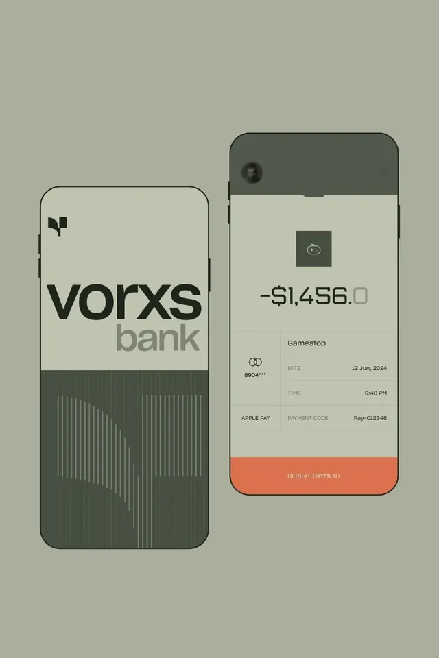
Two-phone fintech mockup with soft sage and charcoal palette, showing a banking app login and a transaction detail view with coral action buttons.
Summary
Two mobile banking screens paired side-by-side: a login card for "vorxs bank" with a subtle geometric pattern, and a transaction detail view for a payment showing amount, merchant name, date, time, and a coral "Repeat Payment" button.
Visual description
A light-background composition with two rounded-corner phone frames separated by minimal white space. Left frame holds a sage-green section above a charcoal bar with vertical line animation, capped by the "vorxs" logotype in heavy sans-serif and gray "bank" text. Right frame shows a transaction view: dark header with user avatar, centered transaction amount in large numerals, merchant name "Gamestop" below, card details and Apple Pay code in a light-background card, and a warm coral button spanning the full width. The palette uses soft, desaturated greens and grays with one warm coral accent. Typography is clean, modern sans-serif in black and mid-gray. The overall effect conveys security and clarity through negative space and minimal visual noise.
Key takeaway
The pairing of two screens to show product flow and context without speech bubbles or arrows. The use of a single saturated accent color (coral) to draw focus to a key action. The geometric bar pattern adding visual interest to an otherwise neutral space without becoming decorative.
Reuse notes
Strong foundation for fintech app presentations, portfolio work, or product mockups. The color palette reads as stable and trustworthy, ideal for payments/banking contexts. Works well when the second screen needs to show a detailed transaction or account view.
More like this



Keep what you find
A free account saves references to boards and can send you a weekly email of picks based on what you save.
To see every result, go Pro.