Preview image. Unlock full-res
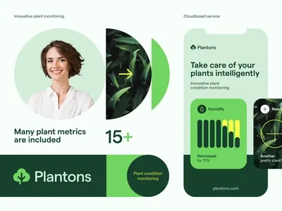
Multi-panel app marketing composition mixing portrait photography, plant imagery, and dashboard UI cards in a green palette, showcasing product features and monitoring capabilities.
Summary
Plant-care SaaS marketing graphic featuring a four-panel composition: portrait of woman + detailed plant photo on left, stats badge in center, app UI mockup with data visualization and feature cards on right, tied together by dark green branding bar.
Visual description
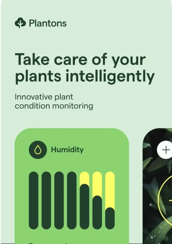
Four distinct panels compose a unified mockup. Far left: a circular-cropped portrait of a woman with brown hair, paired with a vertical rectangle showing a close-up plant. Center: a large stat badge reading "15+" with "Many plant metrics are included" label. Right side: two rounded-corner cards stacked vertically, styled in light green with dark accents, displaying app UI (toggle switches, bar chart, and progress indicator labeled "Humidity: 90%"). Bottom: a dark forest-green bar contains the Plantons logo and website URL. The entire composition uses analogous greens (pale mint to deep forest) with white, black, and yellow accents. Imagery is photographic; UI elements are flat and minimal.
Key takeaway
Mixing real photography (portrait and plant) with app UI mockups in the same frame without visual collision; using soft rounded rectangles and a narrow color palette to unify disparate elements; leading with a stat badge as a focal point between the portrait and feature showcase. This layout pattern effectively communicates product scope (who uses it, what it monitors, how it looks) in a single glance.
Reuse notes
Ideal for SaaS marketing decks, pitch decks, or landing pages targeting practical use cases (agritech, monitoring, health tracking, IoT). The portrait humanizes the product; the plant and chart provide context and credibility. The analogous green palette signals natural/organic and tech simultaneously. Works best when the app UI is clean and the photography is professional; busy or dark backgrounds would lose the layout's clarity.
More like this





Keep what you find
A free account saves references to boards and can send you a weekly email of picks based on what you save.
To see every result, go Pro.