Preview image. Unlock full-res
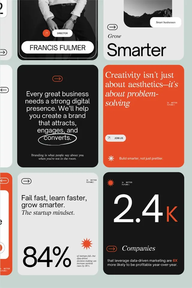
A modular grid of contrasting cards blending business statistics, team photography, and mission statements in black, cream, and burnt-orange accents.
Summary
A modular grid of contrasting cards blending business statistics, team photography, and mission statements in black, cream, and burnt-orange accents.
Visual description
Six rectangular cards arranged in an asymmetric grid: a black card with a director headshot and "FRANCIS FULMER" label; a mint-green card with "Smarter" and "Smart businesses" tag; a burnt-orange card with an italicized manifesto ("Creativity isn't just about aesthetics, it's about problem-solving"); a light gray card with a heading and body copy about digital presence; a white card showing an 84% statistic; and a black card with oversized white "2.4K" and orange accent mark. Burnt-orange navigation arrows appear between cards. Typography alternates between chunky display sans-serif headlines and lighter body text. The palette uses high-contrast black and cream as the dominant base with burnt-orange callouts.
Key takeaway
The modular-card approach for presenting mixed content types (imagery, stats, copy, taglines) without a rigid row/column grid. The burnt-orange accent color acts as a visual thread. The oversized stat (84%, 2.4K) paired with a supporting sentence pattern works for landing pages and case studies.
Reuse notes
Strong template for agency, startup, or B2B case studies. The layout scales across desktop and mobile because each card is self-contained. Works best when alternating dark and light backgrounds to maintain visual separation. The italicized copy block in the orange card provides a subtle contrast to the bold sans-serif elsewhere.
More like this



Keep what you find
A free account saves references to boards and can send you a weekly email of picks based on what you save.
To see every result, go Pro.