Preview image. Unlock full-res
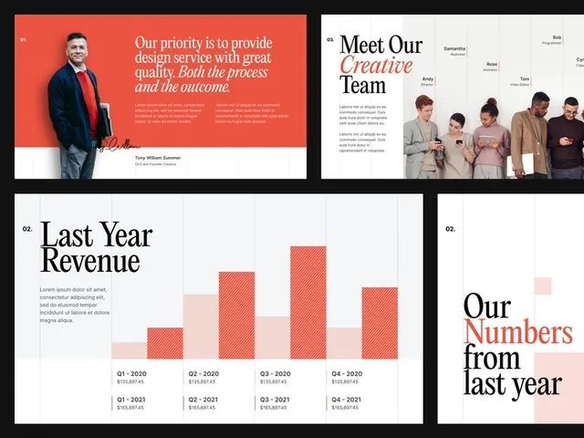
Multi-slide presentation layout featuring a red/coral left-aligned header section with quote, team photo page, and revenue bar-chart slide with text callouts.
Summary
A corporate presentation system using coral-red accent blocks on white, combining a quote slide, team-photo page, and a bar chart slide showing year-over-year revenue growth.
Visual description
Four presentation slides arranged in a grid. Top left: coral-red left-aligned block containing white text ("Our growth is to provide outstanding in all our areas") with a portrait photo of a man in a suit. Top right: white background with "Meet Our Excellent Team" headline in dark sans-serif, below which are four photos of diverse team members arranged horizontally. Bottom left: white background with "Last Year Revenue" headline and a bar chart showing four bars in varying shades of coral-red, labeled with years (Q1-Q4) and percentage figures. Bottom right: white background with "Our Numbers from last year" in large dark serif type (serif-style emphasis on "Numbers"), accompanied by smaller body text. All slides use the same coral-red/white/dark-gray palette; typography is consistently modern sans-serif (except one serif accent). The layout is grid-based with ample white space around text blocks.
Key takeaway
The coral-accent-block pattern: a bold colored rectangle that contains or frames key messaging. The bar chart in matching accent colors creates instant brand reinforcement. The serif accent on "Numbers" breaks expectation subtly and adds visual interest. The team-photo grid is uncluttered and scannable. Each slide can stand alone, but the system is unified by color and grid discipline.
Reuse notes
Excellent template for investor pitches, quarterly business reviews, or company growth narratives. The coral works well for fintech/tech energy; substitute to match your brand. The bar chart is ideal when you have growth to show; the team slide works for "about us" or leadership intros. Slides are dense with information, so best for a speaker-led deck rather than a standalone read-only document.
More like this

Keep what you find
A free account saves references to boards and can send you a weekly email of picks based on what you save.
To see every result, go Pro.