Preview image. Unlock full-res
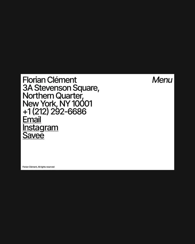
Minimal business card layout with justified address block, contact links, and italic menu label in the negative space of a centered white rectangle on black.
Summary
Minimal Swiss-style contact card: left-aligned stacked address block and social links, balanced by an italic "Menu" label flush-right, all contained in a white rectangle on pure black.
Visual description
Black field with a centered white rectangular card. Left side holds the name "Florian Clement" in bold display sans-serif, followed by the address (3A Stevenson Square, Northern Quarter, New York, NY 10001) broken across four justified lines, then phone number, and three underlined contact links (Email, Instagram, ) in a tighter stack. The top right of the card carries "Menu" in italics, creating deliberate visual tension against the functional information. Footer text reads "Florian Clement, All rights reserved". The white space creates hierarchy through extreme economy.
Key takeaway
The balance between justified body-copy and a single italicized accent label; the use of underlines on select links as a refinement; the way negative space around the card is weaponized, forcing focus.
Reuse notes
Works for portfolio sites, professional identity cards, restaurant or hospitality menus, and any personal brand that values clarity over decoration. The Swiss grid discipline makes it scale well to digital or print.
More like this







Keep what you find
A free account saves references to boards and can send you a weekly email of picks based on what you save.
To see every result, go Pro.