Preview image. Unlock full-res
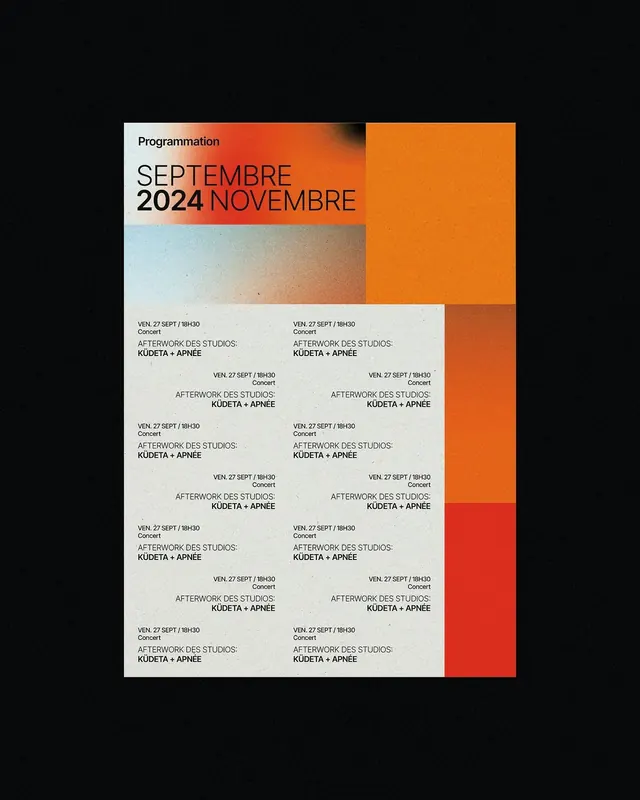
A Dutch-language event calendar for concerts and gallery events using stark typography, color-blocked panels in orange and red, and a structured grid of event details.
Summary
A Dutch-language event calendar for concerts and gallery events using stark typography, color-blocked panels in orange and red, and a structured grid of event details.
Visual description
The poster is divided into distinct zones: a light cream left panel holding "Programmation" in small black type and a large date range in heavy sans-serif (September / 2024 / November) with "SEPTEMBRE" and "NOVEMBRE" split across two lines in orange. The right two-thirds feature hard-edged color blocks in burnt orange and red, creating a gradient stack. The lower two-thirds present a dense grid of small-print event listings (times, titles, "Afterwork des Studios: Kudeta + Apnee") in black sans-serif on pale background, repeating in a strict 2-column layout. Type hierarchy relies entirely on size and weight, with no decorative elements.
Key takeaway
The modular color-blocking system (three distinct hue zones without gradients or blends) creates visual impact while maintaining legibility. The date typography uses mixed weights and sizes to break a simple text line into a poster statement. The dense grid bottom anchors the design without cluttering, using repetition and structure instead of variation.
Reuse notes
Strong reference for event calendars, concert promotions, or editorial calendars that need high contrast and density. Works particularly well when the date range is the hero and events are secondary information. Pairs with strict sans-serif type families. The all-caps treatment demands bold type weight to avoid feeling cramped.
More like this

Keep what you find
A free account saves references to boards and can send you a weekly email of picks based on what you save.
To see every result, go Pro.