Preview image. Unlock full-res
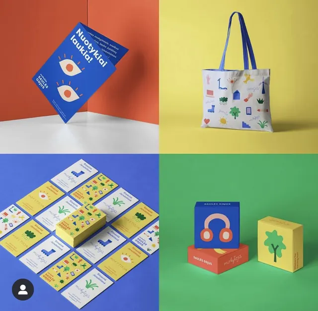
A four-quadrant product display using bold color blocking to create modular brand spaces for packaging, tote bag, and product boxes.
Summary
Four-quadrant product grid using vibrant color blocking (coral, yellow, blue, green) to showcase a cohesive packaging line including printed books, a canvas tote, and product boxes.
Visual description
Split into four distinct colored zones: top-left coral, top-right yellow, bottom-left blue, bottom-right green. Top-left holds a tilted navy book cover with eye icons and white text. Top-right displays a white-and-pastel tote with scattered blue and orange icons (leaves, house, star, numbers). Bottom-left shows an isometric grid of book spines and boxes in yellow and navy with leaf and geometric motifs. Bottom-right holds three stacked boxes: one navy with coral headphones, one coral, one yellow, each branded with a simple plant or icon mark. Clean sans-serif type throughout. White floor grounds the bottom half.
Key takeaway
The modular four-zone layout lets each product type breathe while staying unified by a tight icon and color palette. The isometric book display makes packaging depth and collection feel comprehensive. Flat icon vocabulary (leaves, plants, geometric shapes) repeats across all surfaces, forcing brand coherence.
Reuse notes
Strong for small-batch or craft retailers, subscription boxes, or a product line launch. Works best when you have 3-5 distinct products to showcase simultaneously. Avoid when product photography or detailed features matter more than brand story.