
Preview image. Unlock full-res
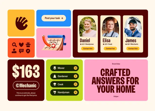
Dynamic photo-grid showing delivery workers and logistics moments paired with solid color blocks and bold sans-serif callouts, building trust through authentic human interaction.
Summary
Dynamic photo-grid showing delivery workers and logistics moments paired with solid color blocks and bold sans-serif callouts, building trust through authentic human interaction.
Visual description
A dense, multi-row grid layout combining candid photos of delivery personnel and customers receiving packages with abstract color fields and overlaid text. The color palette alternates between warm tones (deep maroon, orange, mustard) and cool accents (teal, cobalt), creating visual rhythm without overwhelming the photographs. Text blocks announce stages of the delivery journey: "Your package has arrived", "Delivery in progress", "From your hands to their doorstep", "Don't worry, our drivers are always active". The sans-serif typography uses bold, block letterforms in white or dark text, clearly legible against both images and solid backgrounds. The grid structure is irregular, mixing square photo cells with rectangular color-and-text panels, creating visual interest through asymmetry.
Key takeaway
The combination of authentic human photography with bold color blocks keeps the design energetic without losing focus on the subject. The casual, relatable tone (real workers, genuine customer moments) builds confidence in a service industry. The mixed-media approach (photos plus solid geometry) works better for narrative messaging than pure photography.
Reuse notes
Ideal for logistics, delivery, or e-commerce platforms that want to emphasize human touchpoints and reliability. Works well at a glance as a landing-page hero or testimonial section. The irregular grid is flexible; you can swap photos and reuse the color and text treatment.
More like this
Keep what you find
A free account saves references to boards and can send you a weekly email of picks based on what you save.
To see every result, go Pro.