Preview image. Unlock full-res
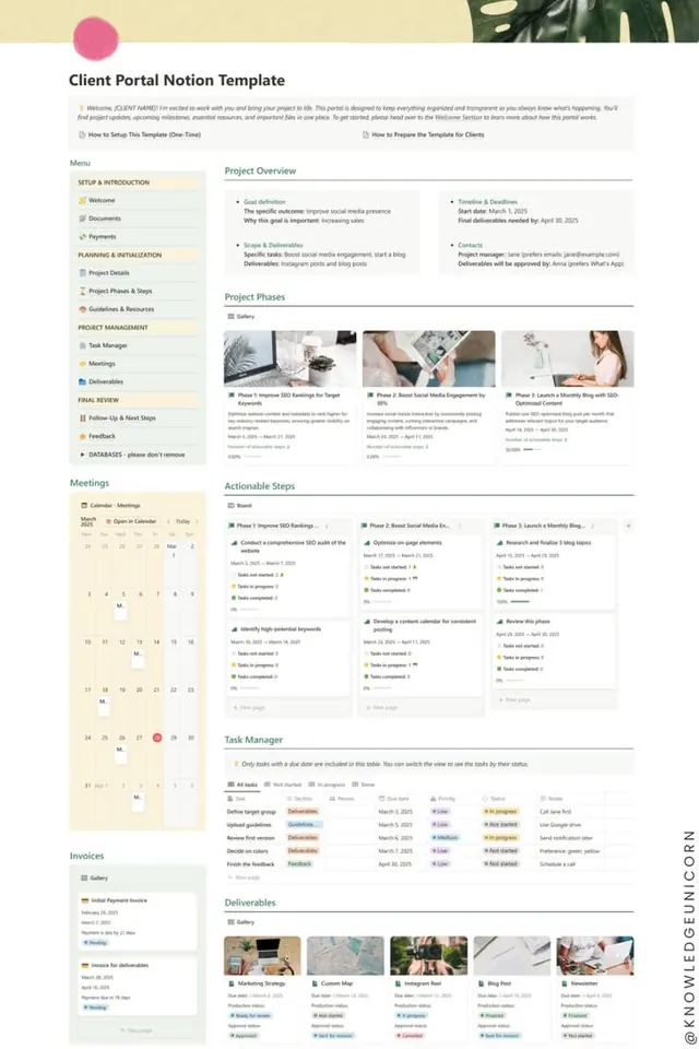
Project management portal template with sidebar navigation, multi-page dashboard layout, and integrated timeline, photography grid, and task tracking UI.
Summary
A comprehensive client portal template showing multi-section project dashboard with sidebar menu, project overview cards, phase timeline with photography, task manager with color-coded status, and deliverables gallery grid.
Visual description
Full-page dashboard layout with left sidebar containing navigation sections: Setup, Planning, Project Management, Final Review. Main content area displays Project Overview with goal definition, scope, and timeline sections; a three-column phase grid showing project phases with dates and sample photography; an Actionable Steps section with progress indicators and status tags in warm tan and muted green; a Task Manager table with color-coded priority and status badges (In Progress, Not Started, Done); and a Deliverables section with thumbnail gallery grid of lifestyle photography. Calendar widget in sidebar shows month view. Typography is clean sans-serif in varying weights; color palette relies on warm beige, tan, and soft olive-green accents against white. Status indicators use warm orange-tan for active items and muted tones for secondary information.
Key takeaway
The sidebar navigation architecture separating setup, planning, execution, and review phases creates intuitive mental model. The combination of different data presentation formats (cards, tables, grids, timeline) shows how to display project information at multiple scales. The warm accent colors (tan, muted green) paired with neutral backgrounds provide professional, calm usability without stark contrast.
Reuse notes
Ideal template for client-facing project management, creative services portals, and agency workflow tools. The modular card/section approach is easy to customize per project type. Works well when projects have visual assets (photography, mockups) to showcase alongside text information. The color palette reads as trustworthy and creative-friendly; avoid on very technical or data-heavy dashboards where higher contrast may be needed.
More like this
Keep what you find
A free account saves references to boards and can send you a weekly email of picks based on what you save.
To see every result, go Pro.