Preview image. Unlock full-res
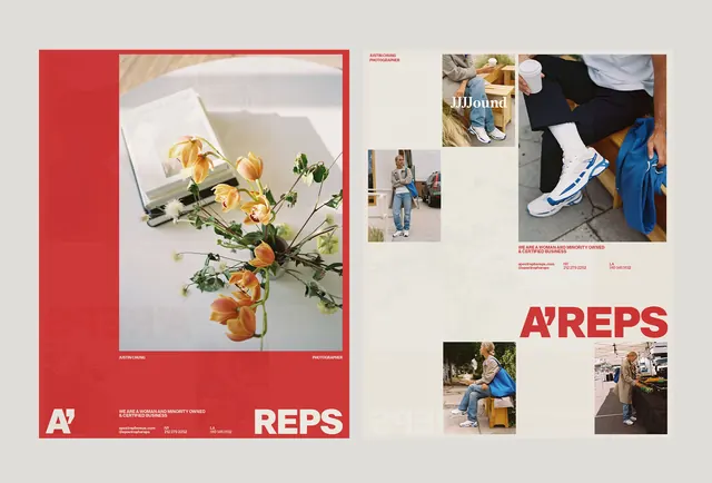
A two-page portfolio or lookbook layout pairing a bold red left panel with curated lifestyle product photography and white grid-aligned text on the right.
Summary
A two-page portfolio or lookbook layout pairing a bold red left panel with curated lifestyle product photography and white grid-aligned text on the right.
Visual description
A horizontal spread showing contrasting page layouts. The left page is dominated by a deep red block occupying roughly half the width, containing a large product photo (overhead shot of arranged objects and florals) and the brand mark "A/" at bottom-left in white sans-serif. The right page is cream-white with a loosely aligned grid of smaller lifestyle photographs (products, hands, fashion detail shots) scattered across the upper two-thirds and the large brand wordmark "A/REPS" positioned in red sans-serif on the lower portion. Thin red lines accent certain photograph borders and guide the eye through the layout. Generous white space around elements reinforces a gallery-like presentation.
Key takeaway
The asymmetric two-page spread demonstrates how a single accent color (red) can anchor visual hierarchy across opposite pages without being repetitive. The contrast between a bold photo-centric spread (left) and a multi-image grid (right) creates visual rhythm and sustains interest. The careful placement of the brand mark in different sizes and colors (white on red, red on white) builds brand recognition through variation rather than repetition.
Reuse notes
Strong for lookbooks, product portfolios, or lifestyle brand presentations where photography is the hero. The layout favors high-quality, curated imagery and works best when photos have compositional clarity. The red accent is bold and reads well in print and digital. Consider this layout when you want to present a collection of items without crowding them or resorting to a uniform grid.
More like this



Keep what you find
A free account saves references to boards and can send you a weekly email of picks based on what you save.
To see every result, go Pro.