Preview image. Unlock full-res
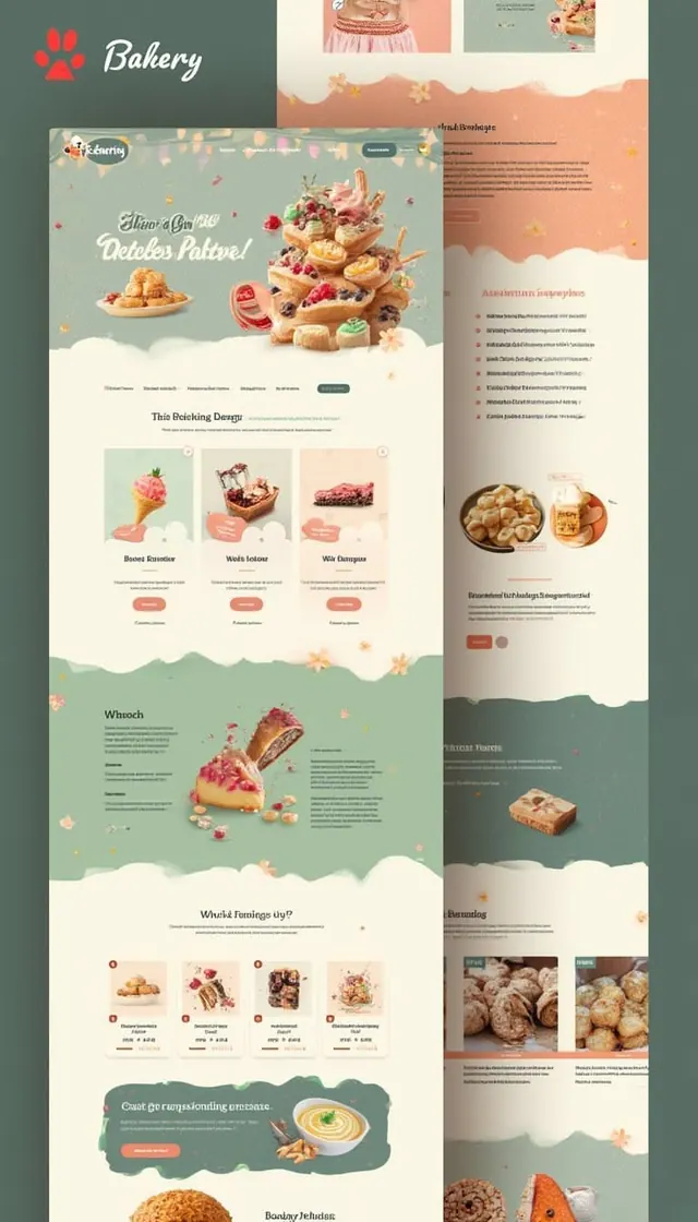
Food brand website and deck featuring soft wavy dividers separating sections, warm pastel palette with teal and cream, and lifestyle product photography.
Summary
Food brand website and deck featuring soft wavy dividers separating sections, warm pastel palette with teal and cream, and lifestyle product photography.
Visual description
A two-page vertical layout for a bakery brand showing consistent use of soft wavy section dividers in cream/white against teal-green backgrounds. The left page leads with a red paw logo and "Bakery" text in a handwritten script, followed by a hero section of stacked pastries on a teal background with hand-drawn flourishes. Below sits a three-column grid showcasing individual products (Roasted Croissant, Welsh Loiter, Win Croissus) with product photography, descriptions, and repeating wavy dividers. The right page continues with a darker green sidebar featuring Russian text (likely "About us" and feature list) paired with lifestyle food photography on a warm peachy-pink background. Throughout, the palette alternates between teal-green and cream with touches of warm peachy tones. Typography mixes a clean sans-serif for body copy with loose script lettering for headers and accents. Decorative scattered golden stars and flourishes reinforce the crafted, artisanal feel.
Key takeaway
The wavy divider as a branded shape element that unifies disparate sections without rigid geometry. Soft, adjacent warm and cool tones (peachy pink on teal) that feel sophisticated rather than candy-colored. Product photography paired with lifestyle shots on a two-page spread to tell a complete story of the brand, not just the product.
Reuse notes
Perfect for food and beverage brands, bakeries, restaurants, artisanal producers, and culinary e-commerce. The handwritten logo and script accents feel personal and small-batch while the clean sans-serif body copy stays readable. The wavy dividers become a signature element that scales across web pages and multiple deck slides. Test the peachy-on-teal contrast for accessibility; consider a darker tint if text sits on the peachy layer. Works equally well as a website flow or a PDF presentation.
More like this

Keep what you find
A free account saves references to boards and can send you a weekly email of picks based on what you save.
To see every result, go Pro.