Preview image. Unlock full-res
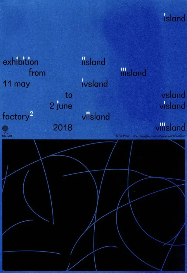
Event poster layering scattered typography over a deep indigo ground, with flowing blue line-topology patterns anchoring the lower half.
Summary
Event poster layering scattered typography over a deep indigo ground, with flowing blue line-topology patterns anchoring the lower half.
Visual description
Deep indigo background with white, black, and dark-text fragments scattered asymmetrically across the upper two-thirds: exhibition dates (11 may to 2 june 2018), the word "exhibition" in large lowercase sans-serif, "factory" logotype lower-left, and artist credits bottom-right. The bottom third is a solid black field containing sinuous, interlocking blue lines forming abstract circular and curved topological patterns, creating visual rhythm and contrast against the solid color above. The overall composition balances precise, centered typographic information against organic, flowing abstract geometry.
Key takeaway
The scatter-and-anchor tactic: distribute text across whitespace for visual interest, then ground it with a cohesive abstract element. The color pairing of warm/cool saturation over a cool base (indigo) creates calm precision without coldness. Topology as a secondary visual system that echoes the text without competing.
Reuse notes
Strong for event posters, gallery announcements, and academic exhibitions seeking minimal formality. The typographic scatter works best when dates and credits are brief; legibility drops with lengthy copy. Pairs well with monospace or display sans-serif faces; serif would feel dated.
More like this


Keep what you find
A free account saves references to boards and can send you a weekly email of picks based on what you save.
To see every result, go Pro.