Preview image. Unlock full-res
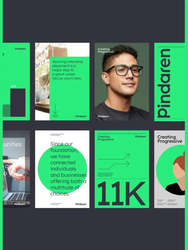
A modern recruitment or careers branding layout using a grid of lime-green and dark-gray panels mixing portraits, sans-serif type, photography, and circular design elements.
Summary
A bold grid-based recruitment page featuring bright lime-green and dark-gray panels, mixing portrait photography, sans-serif headlines, and circular badge elements to communicate team and opportunity.
Visual description
A 3x3 grid composition alternates between lime-green and dark-gray panels. Green panels contain bold sans-serif type ("Linkedin"), circular green badges with white text showing statistics like "11K", and lifestyle photography of diverse individuals. Dark gray panels display both photography and typography, creating rhythm across the layout. The bright lime-green creates maximum contrast and draws the eye, while sans-serif type is large and legible. Circular elements (badges, profile frames) soften the grid's geometry. Portrait photography of diverse individuals emphasizes inclusion and approachability.
Key takeaway
The neon-bright accent color against a dark neutral ground immediately signals modern and energetic without complexity. The grid enforces structure while circular elements provide visual relief. Mixing photography with type directly on the grid allows each panel to tell a distinct story (a person, a statistic, a value proposition) while maintaining cohesion. Large sans-serif type ensures readability and contemporary feel.
Reuse notes
Excellent for tech, SaaS, recruitment, or any B2B brand targeting younger or modern audiences. The high-contrast bright-green approach works well in digital but can appear overwhelming in print; test the color intensity if adapting. The grid structure scales readily to different panel counts, and the formula (photo, type, badge) is flexible and repeatable.
More like this





Keep what you find
A free account saves references to boards and can send you a weekly email of picks based on what you save.
To see every result, go Pro.