Preview image. Unlock full-res
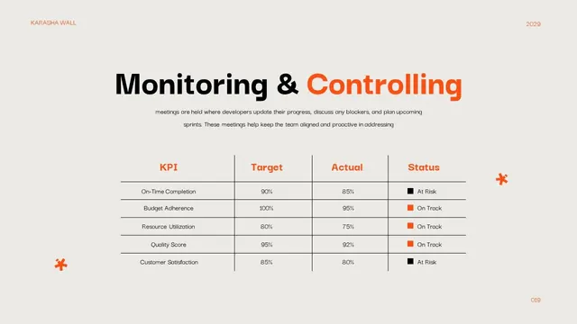
Corporate presentation slide displaying project monitoring metrics in a clean table format with orange accent headers, status badges, and explanatory body copy.
Summary
A project status slide showing five key performance indicators in a table format with target, actual, and status columns, using orange accents and color-coded badges.
Visual description
A presentation slide with a neutral beige background displays the header "Monitoring & Controlling" in black and orange type, followed by explanatory body text about team alignment meetings. Below sits a clean bordered table with five rows: On-Time Completion (90% target, 85% actual, marked "At Risk" in black), Budget Adherence (100% / 95%, orange "On Track"), Resource Utilization (80% / 75%, orange "On Track"), Quality Score (95% / 92%, orange "On Track"), and Customer Satisfaction (85% / 80%, black "At Risk"). Small orange asterisk icons flank the table for visual interest. Thin dividing lines separate rows; the header row uses orange text. Typography is clean sans-serif with strong hierarchy and ample whitespace.
Key takeaway
Color-coded status badges (orange "On Track", black "At Risk") allow instant visual scanning without reading. Pairing actual against target numbers makes performance immediately tangible. Anchoring the table with explanatory copy above prevents the data from feeling cold or isolated. The orange accent provides energy without overwhelming the neutral palette.
Reuse notes
Ideal for sprint reviews, quarterly business reviews, client presentations, and internal dashboards. The format scales to 3-7 metrics; beyond that, consider breaking into multiple slides. Works best when metrics have meaningful targets and actual data. Add context copy above or below explaining what constitutes "At Risk" or "On Track" status for unfamiliar audiences.
More like this





Keep what you find
A free account saves references to boards and can send you a weekly email of picks based on what you save.
To see every result, go Pro.