Preview image. Unlock full-res
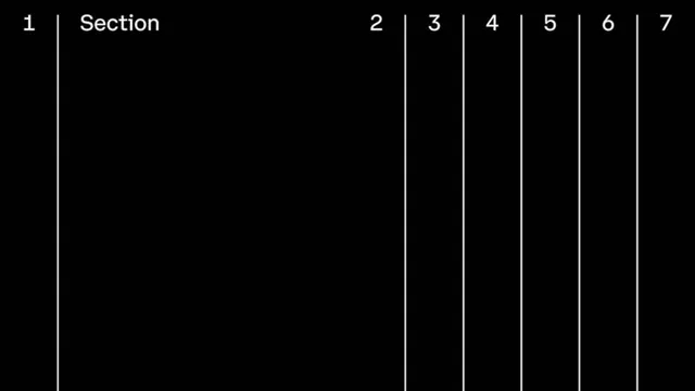
Black-and-white typographic index or table of contents divider using tall vertical lines to separate numbered sections across the entire width.
Summary
A stark divider page using evenly spaced vertical lines and tabular numbering (1 through 7) to separate and label sequential sections with minimal visual language.
Visual description
Jet black background with white sans-serif numbers and a single word "Section" anchoring the left margin. Seven tall vertical white lines extend the full height, creating evenly spaced columns; numbers 2 through 7 sit above their corresponding lines at the top. The composition is purely linear and systematic, with generous white space dominating. No decoration, no color variation; the only visual information is the grid itself and the typography at the top. The treatment is clinical and orderly, suitable for technical documentation, a book index, or a navigation scheme.
Key takeaway
The vertical-line divider as structural grammar: repeating thin rules create a scannable visual rhythm that organizes information without a single decorative element. The numbering is functional, not ornamental; it tells you where you are and how many sections exist. Pair this with ample breathing room (the black void) to signal hierarchy and seriousness.
Reuse notes
Use in print and digital design where technical clarity and editorial rigor matter: scientific journals, technical manuals, instructional materials, tabbed interfaces. The black-on-white extreme contrast ensures legibility at any scale. Because it carries no brand signal, it's flexible enough to work across contexts, though the austere aesthetic skews institutional or academic. Best paired with a serif or modern sans-serif body text.
More like this








Keep what you find
A free account saves references to boards and can send you a weekly email of picks based on what you save.
To see every result, go Pro.