Preview image. Unlock full-res
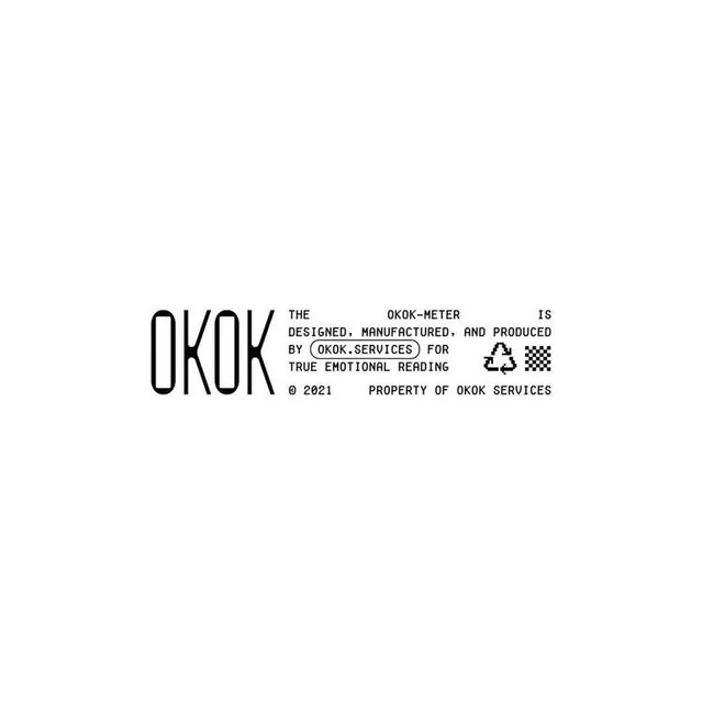
A minimalist single-sheet product specification for an emotional-coaching service, using condensed sans-serif type and monochromatic gray on white.
Summary
A minimalist single-sheet product specification for an emotional-coaching service, using condensed sans-serif type and monochromatic gray on white.
Visual description
White background with black sans-serif type arranged in a left-aligned, dense block. The word "OKOK" appears large at left in condensed sans-serif (unusual stroke-width variation). To the right, fine-weight copy reads "THE OKOK-METER IS DESIGNED, MANUFACTURED, AND PRODUCED BY (OKOK.SERVICES) FOR TRUE EMOTIONAL READING" followed by a small checkerboard pattern and "2021 PROPERTY OF OKOK SERVICES" with a circled-R registered mark. Typography is entirely mono-weight, justified left, with minimal line spacing and no visual hierarchy beyond font size. A small, crude checkerboard graphic in the copy suggests certification or testing. The stark layout prioritizes information clarity and credibility over visual flourish.
Key takeaway
The use of industrial specification language for a service (normally found on product packaging or technical sheets). The checkerboard mark as a minimal credibility indicator. The visual restraint that conveys trustworthiness through understatement rather than design decoration.
Reuse notes
Suits healthcare, coaching, or wellness services wanting to signal rigor and clarity over luxury. The declarative, specification-sheet format works when a brand wants to position itself as practical and evidence-based. Works best paired with generous negative space in a full layout; as a card or single element it reads more like a label than a communication. The condensed type emphasizes efficiency and precision.
More like this




Keep what you find
A free account saves references to boards and can send you a weekly email of picks based on what you save.
To see every result, go Pro.