Preview image. Unlock full-res
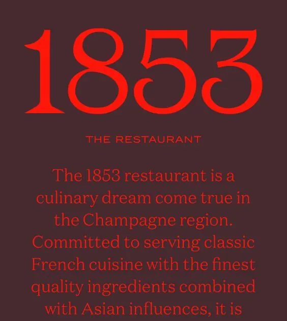
Vertical composition with oversized serif year numerals in bright red on a deep maroon background, anchored by stacked sans-serif text describing a French culinary concept.
Summary
A vertical composition pairing oversized serif numerals (1853) in vibrant red with centered sans-serif descriptive text on a deep maroon background, designed for fine-dining or wine-region branding.
Visual description
The design centers a large year (1853) in a bold serif typeface with bright red fill on a dark maroon ground. Below, "THE RESTAURANT" appears in small all-caps sans-serif in the same red, followed by a justified multi-line description in slightly lighter red text. The color palette consists of the rich dark maroon background with two distinct red tones: a neon-bright primary red for the numerals and a slightly more muted red for the supporting text. All elements are vertically centered and left-justified, creating formal symmetry and quiet elegance. No imagery or decoration, purely typographic.
Key takeaway
The pairing of oversized serif numerals with small sans-serif captions as a hierarchy device; the use of two distinct warm reds on a cool dark ground to create depth and emphasis; the full-justified text block as a visual anchor that reads as secondary information.
Reuse notes
Ideal for restaurant, wine, hospitality, or heritage-brand identity systems. Works especially well when the year or founding mark carries cultural or regional significance. The deep maroon ground requires bright accents to avoid legibility issues; this design nails that contrast. Not suitable for digital-first contexts without adjustment.
More like this





Keep what you find
A free account saves references to boards and can send you a weekly email of picks based on what you save.
To see every result, go Pro.