Preview image. Unlock full-res
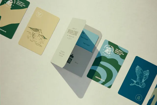
Branded stationery suite featuring hand-drawn botanical line art and a soft earth-tone palette of cream, sage green, and deep teal across business cards and envelopes.
Summary
A branded stationery system using hand-drawn botanical illustrations and a muted earth-tone palette on business cards and envelopes.
Visual description
A flat-lay composition shows six stationery items arranged on a neutral cream background. A deep forest green business card with white line-art birds anchors the top left. A cream-colored card features a minimalist pen-line drawing of a bird in flight. A sage-green envelope displays "Marconi" in small caps with layered color blocks (cream, grey-blue, teal). An adjacent card plays with geometric color blocking in cream, grey, and deep teal, repeating "Make it Slow / Make it Easy" text. A dark teal card showcases a detailed white-line illustration of a flying bird. Throughout, thin sans-serif headlines and sparse typography let the botanical imagery and restrained color story breathe.
Key takeaway
Hand-drawn line art gives artisanal credibility without appearing amateurish. Repeating the bird motif across items creates visual cohesion. Pairing a single bold color (deep teal or green) with cream and soft greys balances sophistication and warmth. Layered color blocks on one card add intrigue to an otherwise minimal suite.
Reuse notes
Strong template for eco-conscious, lifestyle, or design-focused brands targeting premium, educated audiences. Works well for agencies, boutique retailers, publishers, and travel/hospitality. The palette reads mature and naturalistic; avoid pairing with bright neons or loud imagery. The sparse type treatment requires confident brand names to feel intentional.
More like this



Keep what you find
A free account saves references to boards and can send you a weekly email of picks based on what you save.
To see every result, go Pro.