Preview image. Unlock full-res
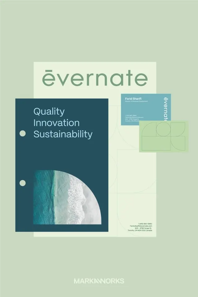
Overlapping stationery and business cards in sage green, cream, and teal demonstrating a coordinated identity system for a sustainability-focused brand.
Summary
Overlapping stationery mockup demonstrating a cohesive brand identity across business cards, letterhead, and contact sheets with a muted sage-green and dark-teal color system.
Visual description
Three overlapping printed pieces arranged diagonally on a soft sage background: a dark teal card on the left with "Quality Innovation Sustainability" as white copy, accented by two white circular dots; a cream-colored vertical card in the center showing the "Evernote" logo with a contributor name and contact details; and a light green business card on the right with a geometric grid overlay and circular cutouts. A curved teal landscape photograph anchors the lower half of the dark card. The layout uses generous whitespace, aligned sans-serif type, and a restrained palette emphasizing contrast through tonal shifts rather than bright color.
Key takeaway
The color restraint: using related tones (sage, teal, cream) that feel premium together. The geometric grid as secondary pattern without overwhelming the clean typography. The curved photography breaking the rectilinear layout to add warmth and visual relief.
Reuse notes
Ideal reference for corporate identity systems, sustainability branding, or b2b collateral. The calm palette and geometric accents translate well to packaging, stationery suites, and annual reports. Works strongest when printed on quality stock; the muted tones require good paper to maintain sophistication.
More like this





Keep what you find
A free account saves references to boards and can send you a weekly email of picks based on what you save.
To see every result, go Pro.