Preview image. Unlock full-res
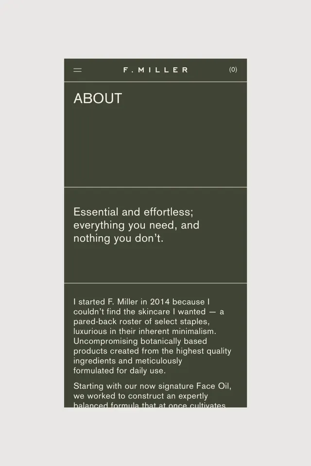
Minimalist about page for a premium skincare brand using muted olive-green background with white sans-serif body text, divided into discrete sections by subtle horizontal lines.
Summary
Minimalist about page for a premium skincare brand using muted olive-green background with white sans-serif body text divided into discrete vertical sections.
Visual description
A mobile-width screenshot of a vertical layout on a muted dark olive-green background. The header contains a hamburger menu icon on the left, centered "F. MILLER" wordmark in white, and a cart icon showing "(0)" on the right, all separated by a subtle horizontal hairline. Below is a large section labeled "ABOUT" in all caps, white sans-serif, occupying roughly one third of the visible area as visual breathing room. A second horizontal line divides this from a copy section describing the brand philosophy: "Essential and effortless; everything you need, and nothing you don't." A third section contains the founder's story, explaining the 2014 origin of the brand and its commitment to botanically-based skincare formulation. All copy is set in white sans-serif, left-aligned, with generous line height and margins. The color scheme is restricted to the muted olive-green background and white text, creating a calm, exclusive visual field.
Key takeaway
The use of horizontal division lines as the only structural element, eliminating the need for cards, boxes, or visual containers. The restraint with color (single background, white text only) creates luxury through subtraction rather than decoration. The large, labeled section headers ("ABOUT") establish hierarchy without bold weights or size changes by virtue of whitespace alone. The founder story is presented as narrative body copy rather than bullet points, reinforcing the hand-crafted, artisanal positioning of the brand.
Reuse notes
A strong template for premium beauty, wellness, or lifestyle brands that position themselves as refined and understated. The muted color palette and minimal typography work particularly well for skincare, wellness, and luxury goods. The vertical section structure is mobile-friendly and scannable while maintaining sophistication. Not recommended for high-energy, trend-driven, or youth-focused categories where this aesthetic would read as cold or inaccessible. The reliance on generous whitespace and reading time makes it less suitable for commerce-first or conversion-optimized contexts.
More like this



Keep what you find
A free account saves references to boards and can send you a weekly email of picks based on what you save.
To see every result, go Pro.