Preview image. Unlock full-res
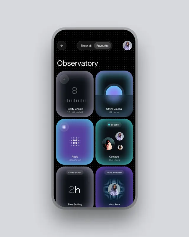
Mobile app dashboard with deep-black background and six gradient-tinted cards displaying productivity and wellness features.
Summary
Mobile app dashboard displaying six equally-sized gradient cards in a 2-column grid over a deep-black background with dot pattern texture.
Visual description
Header bar contains a back arrow, segmented buttons for "Show all" and "Favourite," and a user avatar. The main title "Observatory" sits in white sans-serif above a grid of six rounded-corner cards, each with a distinct gradient: dark-to-purple, teal-to-blue, blue-to-purple, teal-with-emerald accent, dark-gray, and dark-to-magenta. Each card holds white icon, label text, and secondary descriptor (e.g. "Reality Checks, 12h 46min left"; "Contacts, 456 users"). White hairline icons and subtle geometric patterns (dots, lines, grids) appear within each card. Avatar circles and status badges punctuate the layout.
Key takeaway
The systematic card-grid approach to organizing multiple app sections: each card balances icon, heading, and metadata using consistent spacing. The dark ground with cool-toned gradients avoids harsh contrast while maintaining readability. The pattern texture (dots) adds visual depth without demanding attention.
Reuse notes
Perfect template for wellness, productivity, or journaling apps targeting mobile. The 2-column grid scales naturally to iOS and Android. Each card can independently hold different interaction states (chart data, contact lists, status metrics). Works best when each card's visual hierarchy (icon > label > count) stays consistent.
More like this





Keep what you find
A free account saves references to boards and can send you a weekly email of picks based on what you save.
To see every result, go Pro.