Preview image. Unlock full-res
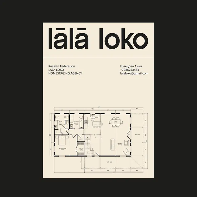
Horizontal business card pairing a bold display logotype with an architectural floor plan diagram.
Summary
A horizontal business card for a Russian homestaging agency that transforms branding into architectural documentation, placing the bold "lala loko" logotype above contact details and a detailed floor plan.
Visual description
Cream-colored card on black background. Bold, black sans-serif logotype "lala loko" dominates the upper third. Below it, left-aligned contact text identifies the business (Russian Federation, LALA LOKO HOMESTAGING AGENCY) and owner (Anna Shvetsova) with phone and email. The lower half is occupied by a technical architectural floor plan rendered in black line work with dimension annotations, showing room layouts, fixtures, and spatial organization typical of a residential design proposal.
Key takeaway
The deliberate confusion of business card and technical document: combining a visual identity mark with actual deliverable work (the floor plan). The restrained palette and line-weight hierarchy make the diagram legible despite the density. The asymmetric layout creates visual rhythm without symmetry.
Reuse notes
Strong reference for service-based brands that create tangible outputs (architecture, design, construction). The floor plan doubles as portfolio proof. The oversized logotype-to-plan ratio establishes the brand first, then delivers evidence. Works best for B2B agencies or technical consultants.
More like this
Keep what you find
A free account saves references to boards and can send you a weekly email of picks based on what you save.
To see every result, go Pro.