Preview image. Unlock full-res
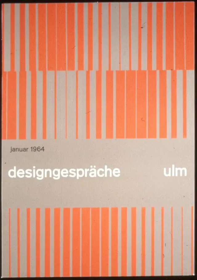
Swiss modernist magazine cover from 1964 using a full-bleed composition of coral and gray vertical stripes framing centered typography and date.
Summary
Magazine cover for Designgesprache Ulm from January 1964, using alternating vertical stripes in coral and warm gray as the dominant graphic device with minimal typography set below.
Visual description
Full-bleed composition divided into three horizontal bands. Top and bottom thirds consist of systematic vertical stripes alternating coral-orange with a warm gray-beige, creating strong rhythmic patterns. The middle band is a calm neutral gray-beige field holding centered lowercase white sans-serif text reading "designgesprache" on the left and "ulm" on the right, with "januar 1964" in smaller type above. The stripes vary slightly in width and alignment between top and bottom, disrupting perfect symmetry while maintaining a tight, ordered grid sensibility. The typeface is a modern grotesque sans-serif, likely Akzidenz Grotesk, set with generous spacing and even kerning.
Key takeaway
A full-bleed pattern (here, stripes) that grounds abstract geometry without overwhelming typography placed in negative space. The discipline of limiting the palette to three colors (coral, gray, white) and letting systematic pattern do all the visual work. Setting text in a color-neutral zone that allows typography to sit clear and calm amid high-contrast pattern.
Reuse notes
Foundational reference for modernist publication design and grid-based pattern systems. Effective for educational institutions, design conferences, and cultural publishers positioning themselves as intellectually rigorous. The stripe pattern is a strong opener for a series or identity system where variation in stripe width or color can modulate across covers. The coral-warm-gray pairing reads as timeless and slightly vintage, so it suits historical, archival, or retrospective contexts better than contemporary tech brands.
More like this



Keep what you find
A free account saves references to boards and can send you a weekly email of picks based on what you save.
To see every result, go Pro.