Preview image. Unlock full-res
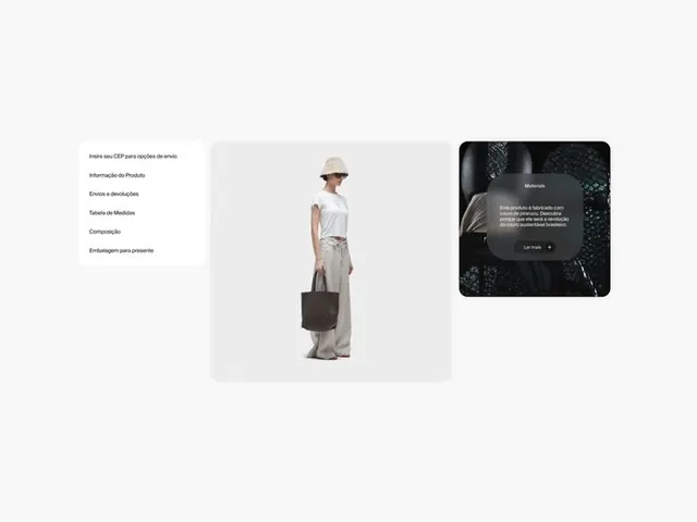
Three-column product layout with left-aligned navigation menu, centered product photograph, and right-side dark modal overlay containing descriptive copy.
Summary
A minimal three-column product layout with left text menu, a centered product photograph on light gray ground, and a dark overlay card on the right containing supporting text and a link.
Visual description
Off-white background grid layout. Left column: six text menu items in dark sans-serif, left-aligned (appears to be Portuguese: "Index um CRP para colecoes", "Informacao do Produto", "Envios e devolucoes", "Tabela de Medidas", "Composicao", "Embalagem para presentes"). Center column: large light-gray rounded rectangle containing a full-length product photograph of a person wearing a neutral outfit (white shirt, beige pants, brown bag, tan hat). Right column: small dark charcoal rounded rectangle with white sans-serif copy and a "Ler Mais" link, overlaid on a textured black-green photographic background. The overall spacing is generous; typography is clean and small-scale.
Key takeaway
The restraint: three distinct zones (navigation, image, detail) with plenty of breathing room. The dark modal card that doesn't compete with the product photo. The generous whitespace allowing the eye to land on the product first, then secondary info.
Reuse notes
Ideal for minimal luxury product sites, fashion/apparel showcases, or e-commerce where the product image is the hero. The sidebar-plus-modal structure works for product details, size charts, or terms. The neutral color scheme suits natural products, fashion, and lifestyle brands. Avoid if you need multiple product images or heavy feature lists.
More like this

Keep what you find
A free account saves references to boards and can send you a weekly email of picks based on what you save.
To see every result, go Pro.