Preview image. Unlock full-res
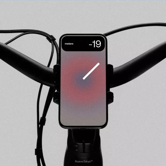
Mobile app interface mounted on a bicycle handlebar showing a fitness tracking screen with pink-to-gray gradient background, elevation metric, and minimal gauge indicator.
Summary
A phone mounted on bicycle handlebars displays a minimal fitness tracking app screen with gradient background (warm pink to cool gray) showing elevation data (-19 meters) and a white progress indicator.
Visual description
A smartphone is affixed to a bicycle handlebar via a black mount against a light gray background. The phone screen shows a mobile app interface: the top section displays "meters" in white text with a numeric value of "-19" in large white sans-serif; below that a gradient fills the screen, transitioning from warm dusty-pink in the upper area through mauve to cool gray at the bottom. A single white diagonal line (progress bar or gauge) crosses the gradient, suggesting an elevation change or climbing metric. The aesthetic is minimalist and contemporary, with significant whitespace and a focus on numeric clarity. The contrast between the cold gray background and warm gradient on screen creates visual interest.
Key takeaway
The gradient as a quantitative visualization tool rather than a decorative element, where color shift maps to data (elevation change). The minimalist interface with one primary metric and one visual indicator avoids clutter while maintaining clarity. The product mockup (phone on bike) contextualizes the app in real-world use, adding credibility to the design.
Reuse notes
Excellent reference for fitness or outdoor activity app interfaces, particularly sports tracking where numeric precision is critical. The gradient-as-data pattern works well for visualizing ranges, progress, or values over time. The monochromatic typography combined with the warm-to-cool gradient provides visual sophistication without multiple typefaces. Works across health, cycling, running, and navigation app categories.
More like this


Keep what you find
A free account saves references to boards and can send you a weekly email of picks based on what you save.
To see every result, go Pro.