Preview image. Unlock full-res
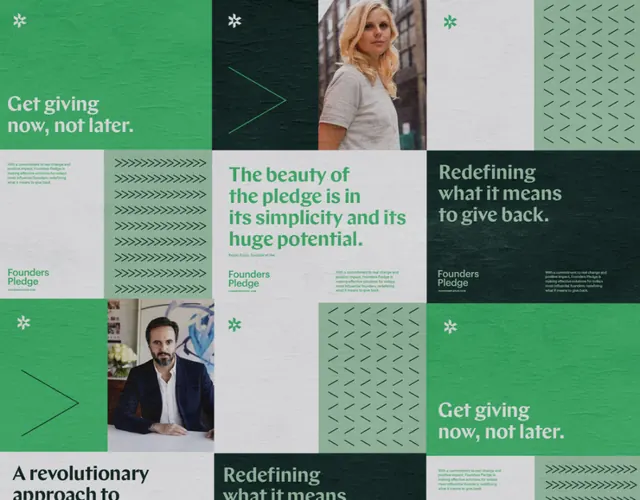
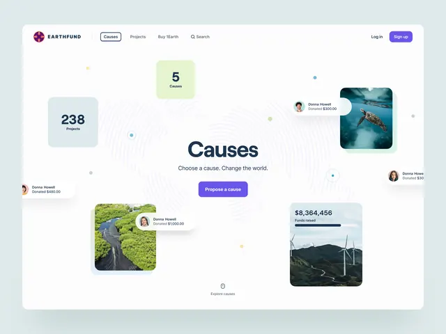
Modular grid-based page layout for a giving platform, using sage green and off-white to separate messaging blocks and photography in a calm, purposeful composition.
Summary
Grid-based web layout for a giving platform, pairing blocks of sans-serif display type with photography and muted green backgrounds to create a calm, purposeful donor experience.
Visual description
The layout employs a strict modular grid dividing the screen into rectangular blocks of varying sizes. Top section presents "Get giving now, not later" as a display headline in bold sans-serif, flanked by portrait photographs and smaller body text explaining a donor mission. Bottom section shows "A revolutionary approach" and "Redefining what it means to give back" as additional display type, each paired with color-blocked sections in sage green (#8BAD95 or similar) alternating with off-white (#D1D2D3) backgrounds. Typography is exclusively clean sans-serif in display and body weights; there is minimal decorative imagery, relying instead on the structured grid itself as the organizing principle. The color palette centers on muted, cool-toned greens mixed with neutral off-whites and charcoal text, evoking natural, trustworthy, and calm institutional authority.
Key takeaway
The modular grid system itself as a structural framework that organizes both text and image without needing large headers or decorative dividers. The color blocking (green against off-white) creates visual separation and rest areas for the eye without adding noise. Typography hierarchy relies on size and weight alone, not color shifts, maintaining visual unity. The restraint in using photography - portraits and real people rather than stock imagery - builds authenticity.
Reuse notes
Perfect for nonprofit, social-impact, healthcare, or community-focused organizations wanting to convey purposeful mission-driven work. The calm green palette signals trust and wellness; works well for causes like giving platforms, mental health, or environmental missions. The modular grid scales well across breakpoints and suits long-form content like impact reports or donor journeys. Avoid overloading the grid; this design's power comes from restraint and breathing room.
More like this





Keep what you find
A free account saves references to boards and can send you a weekly email of picks based on what you save.
To see every result, go Pro.