Preview image. Unlock full-res
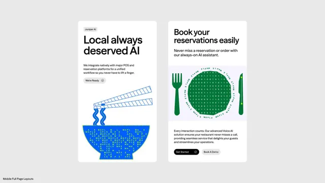
Two side-by-side cards describing an AI reservation platform, each pairing bold sans-serif headers, explanatory body text, and playful pixel-art or line-drawn iconography in green and blue.
Summary
Two vertically stacked cards marketing an AI-powered restaurant reservation system, using clean typography, explanatory copy, and domain-specific iconography in teal green and cobalt blue.
Visual description
The layout presents two white cards on a light gray background. The left card introduces "Juniper AI" with the headline "Local always deserved AI" in heavy sans-serif display type. Below is explanatory copy about POS/reservation-platform integration, a "We're Ready" status badge, and an illustrative graphic of parallel blue wavy lines flowing into a blue bowl filled with repeated "MAPLE" text. The right card offers "Book your reservations easily" in bold display type, body copy promising an AI assistant, a green circular plate-form graphic centered with white binary code and flanked by green fork and knife icons, plus "Get Started" and "Book A Demo" buttons below. Both cards use high-contrast black text on white, with color only in iconography and small UI elements.
Key takeaway
The pairing of functional typography with semantically clear icons (fork/knife for food, binary for data processing) grounds abstract AI copy in concrete hospitality concepts. The two-card format allows parallel comparison without overwhelming a single view. The duotone color scheme (green for food, blue for technology) reinforces domain expertise.
Reuse notes
Effective for SaaS pitches targeting service industries. The minimal card structure scales to more cards without visual fatigue. The icons work because they are simplified and intentional, not decorative. Best suited when you have two distinct features or use cases to present side by side.
More like this







Keep what you find
A free account saves references to boards and can send you a weekly email of picks based on what you save.
To see every result, go Pro.