Preview image. Unlock full-res
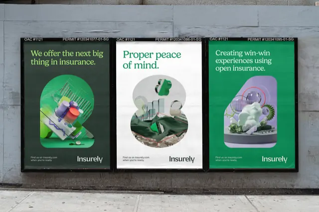
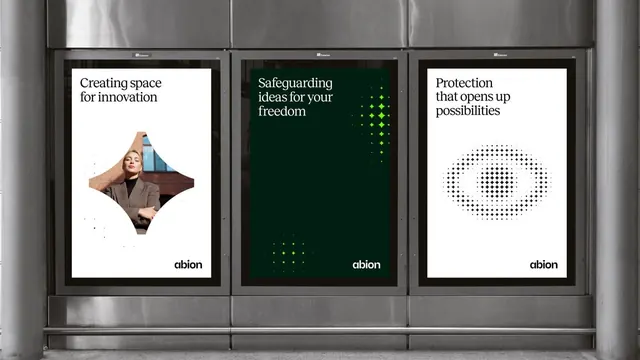
Three-poster campaign using botanical photography and consistent modular layout to convey insurance industry themes of protection and growth.
Summary
Three-poster campaign pairing clean typography with softly lit botanical photography and circular motifs to position an insurance brand as modern, protective, and trustworthy.
Visual description
Three vertical posters arranged in a grid, each roughly square. Left: "we offer the most comprehensive coverage" over an image of green foliage forming a circular shape. Center: "Proper peace of mind" on a deep dark-green background with a single white flower photograph and lime-green circular dot pattern. Right: "Creating security with freedom" with a circular white-and-gray abstract graphic made of fine dots. Each poster displays the Insuredata wordmark in lowercase sans-serif at the bottom. The color palette alternates between white and dark-green backgrounds, with consistent use of muted gray and pale botanical tones.
Key takeaway
The modular three-poster system allows message variety while maintaining visual cohesion through repeated circular geometry, consistent typography, and a tight dark-green/white/muted-accent palette. Botanical photography softens the corporate message and conveys growth and organic protection. The simple dot-pattern graphics are minimal but distinctive and memorable.
Reuse notes
Works well for fintech, insurance, or financial-services campaigns that need to balance professionalism with approachability. The botanical imagery particularly suits sustainability messaging or wellness-adjacent financial products. The muted palette reads premium without coldness. Plan for consistent three-piece deployment for maximum impact.
More like this





Keep what you find
A free account saves references to boards and can send you a weekly email of picks based on what you save.
To see every result, go Pro.