Preview image. Unlock full-res
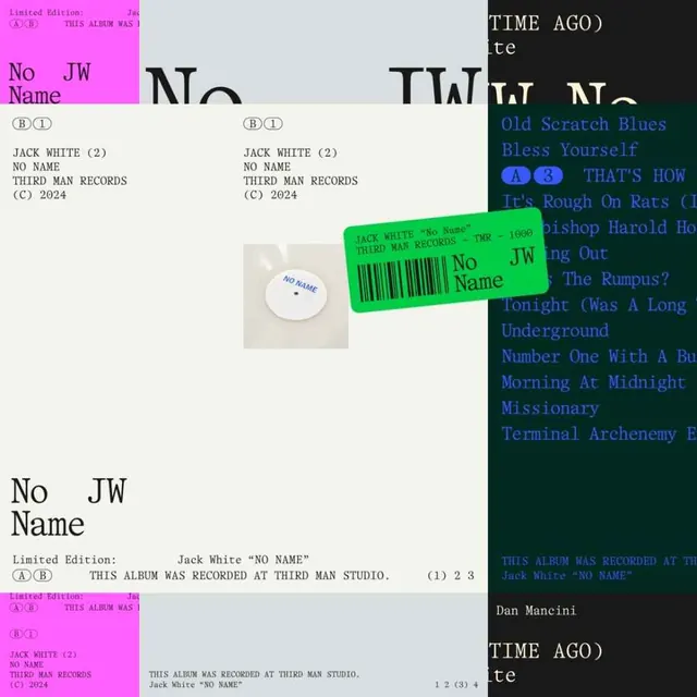
Collage of music release design templates and physical packaging mockups (CD, barcode, labels) for independent vinyl and digital releases, in stark monochrome and neon accent colors.
Summary
A contact-sheet-style collage of record label branding and packaging specifications, mixing flat layouts, physical mockups, and neon-colored accents on a neutral background.
Visual description
The composition is divided into overlapping quadrants showing different release formats: top left has a bright magenta panel with artist and album information in small monospaced type; center-right shows typographic treatments in bold sans-serif reading "No JW Name" repeated; a physical white CD mockup sits bottom-center with a bright green barcode label overlaid; the right edge features a dark ground with cyan-blue monospaced type listing track titles. Throughout, small circled letters (A, B, C, 1, 2, 3) indicate variations or versions. The stark white background unifies the scattered elements, creating an archival, utilitarian feel emphasizing clarity and systematic organization.
Key takeaway
Using bright neon (magenta, cyan, neon green) as functional accent color in a mostly monochrome system. The legibility of monospaced type at small scale. Showing design systems through repeated variations and circled version markers. The document-like aesthetic that makes packaging design feel like technical specification.
Reuse notes
Ideal for indie label branding, music industry portfolios, or design systems documentation. The neon-on-neutral approach works for tech product packaging too. The systematic variation approach transfers to any design that needs to show multiple related solutions at once.
More like this



Keep what you find
A free account saves references to boards and can send you a weekly email of picks based on what you save.
To see every result, go Pro.