Preview image. Unlock full-res
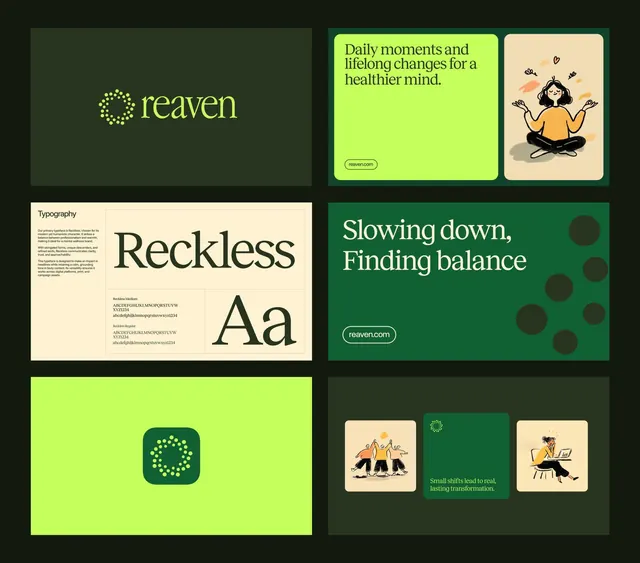
Multi-panel brand guide for Reaven wellness platform showing logo, typography, and illustrated application examples on deep green and lime backgrounds.
Summary
A six-panel brand identity system for Reaven, a wellness app, balancing typography, illustrated user moments, logo lockup, and messaging across deep forest green and vibrant lime color blocks.
Visual description
The layout arranges six panels in a 2x3 grid on a black background. Top-left shows the Reaven logo (a dotted circular mark in lime) on forest green. Top-right pairs the tagline "Daily moments and lifelong changes for a healthier mind" in serif headline text against bright lime, with a simple line-drawn illustration of a woman meditating in mustard and cream on cream ground. Middle-left features a typography specimen showing "Reckless" in a large, confident serif display face with character set and weight information below on cream ground. Middle-right displays "Slowing down, Finding balance" in white serif over forest green with decorative dark circular shapes. Bottom-left shows the Reaven mark in a rounded square icon format on lime. Bottom-right presents three small illustrated scenes (group meditation, workspace) separated by the forest green mark on dark ground with centered tagline.
Key takeaway
The pairing of serif headlines with a vibrant single accent color (lime) creates sophistication while ensuring wellness messaging feels approachable. The modular illustration style (line drawings in warm orange, minimal shading) scales from icon to full scene while maintaining visual unity. Grid-based organization with generous contrast between green, lime, cream, and illustration makes the brand system scannable and memorable.
Reuse notes
Effective for healthcare, wellness, or mental-health apps targeting a modern, professional-but-warm audience. The serif choice lifts a casual wellness narrative toward credibility. The dark forest green pairs well with bright lime for high accessibility. Illustration style particularly suits messaging around balance and mindfulness.
More like this




Keep what you find
A free account saves references to boards and can send you a weekly email of picks based on what you save.
To see every result, go Pro.