Preview image. Unlock full-res
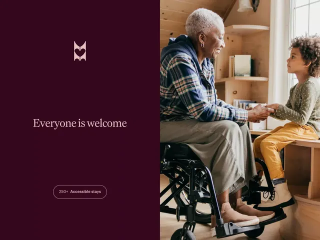
Corporate design balancing a deep burgundy text block with accessibility messaging against warm, human photography emphasizing intergenerational connection and wheelchair inclusivity.
Summary
Left-right split composition pairing a deep burgundy text panel with an accessible stays callout against a warm photograph of an older man in a wheelchair engaging with a young girl in a wood-lined interior.
Visual description
The layout divides vertically: left side (roughly one-third) features a deep maroon-burgundy background with a white geometric logo mark at the top, followed by "Everyone is welcome" in a serif font and a rounded pill button reading "250+ Accessible stays". Right side (two-thirds) shows documentary photography: a senior man in a navy plaid shirt sits in a wheelchair facing a child in a mustard-yellow jacket and dotted green top. Behind them, warm wood shelving and natural light from a window create depth. The wood tones, skin tones, and textile patterns echo the palette established on the left.
Key takeaway
The restraint of the left panel: a single mark, concise copy, one button. The photography does the persuasion work without captions. The color story (deep burgundy + warm wood + golden light) feels inviting, not clinical. The split forces a reading order and makes the accessibility statement structural, not an afterthought.
Reuse notes
Strong for healthcare, hospitality, senior living, and accessibility-focused organizations. The typography pairing (serif headline, sans-serif metadata) is readable at any scale. Best when you have genuine, unbookended photography. Avoid if your brand leans cold or minimal. The deep burgundy is bold; ensure sufficient contrast for accessibility.
More like this

Keep what you find
A free account saves references to boards and can send you a weekly email of picks based on what you save.
To see every result, go Pro.