Preview image. Unlock full-res
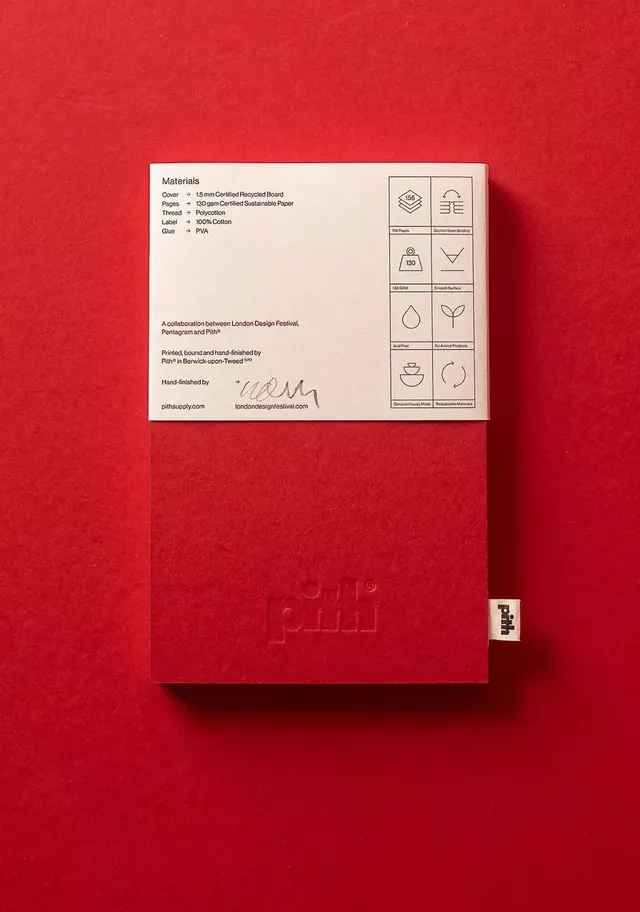
Hand-finished printed booklet covers sustainable material specifications with icons, collaboration branding, and site credits in an editorial layout.
Summary
A printed booklet cover documenting material specifications for a hand-finished collaborative project, pairing bold red stock with cream interior pages and a curated grid of craft icons.
Visual description
Inside front cover of a bound booklet with cream pages. Left side lists material specs: cover (15mm recycled board), pages (130gsm sustainable paper), thread (polyester), labels (cotton), and glue (PVA). Right side displays a grid of eight line-drawn icons representing certifications, material properties, and process (FSC logo, recycled symbol, water-drop, cone shape, droplet, leaf, two-part cup icon, circular arrow). Bottom credits cite a collaboration between London Design Festival, Pentagram, and Pit Print (printed and hand-finished in Berwick-upon-Tweed), with handwritten designer signatures and URLs (pithausupply.com, londondesisgfestival.com). Cream paper and black type are framed by a bold red outer cover visible in the left edge.
Key takeaway
A textured, craft-forward approach to transparency: material specs and production credits displayed as a visible, designed element rather than hidden footnotes. The icon grid is a compact way to communicate compliance and process without lengthy labels. Hand-finished touches (ink signatures, edge-bound construction) elevate a functional spec sheet into a collectible object.
Reuse notes
Effective for design studios, print-focused agencies, or sustainable brands that want documentation to reinforce brand story. The grid-of-icons pattern works for any certification or material story (organic, fair-trade, local-made, archival). Best paired with restrained color and generous white space so the icons and craft details read clearly.
More like this


Keep what you find
A free account saves references to boards and can send you a weekly email of picks based on what you save.
To see every result, go Pro.