Preview image. Unlock full-res
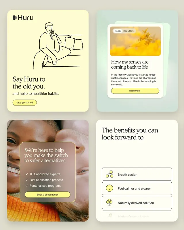
Wellness app UI in four soft cards: line-drawn onboarding illustration, sensory recovery narrative card, trust-building testimonial overlay, and benefit checklist with icon accents.
Summary
A wellness app UI using four soft-colored cards to guide users through onboarding, testimonial, product education, and benefit listing, with line illustration and warm, muted tones anchoring trust.
Visual description
Four cards arranged in a 2x2 grid on a warm beige background. Top-left: pale yellow card with "Huru" wordmark and a minimalist line-drawn illustration of a person meditating at home, plus a "Let's get started" button in yellow. Top-right: soft green card with "How my senses are coming back to life" headline, a golden landscape photo, tab navigation (Health, Helpful Info), and a yellow "Read more" button. Bottom-left: a close-up photo of a smiling person with an overlaid tan-brown rounded box containing three checkmarks ("TGA approved experts", "Fast application process", "Personalised programs") and a yellow "Book a consultation" button. Bottom-right: white card listing four benefits as icon + text pairs (bee icon for "Breath easier", face icon for "Feel calmer and clearer", plant icon for "Naturally derived solution", and faded fourth item).
Key takeaway
The soft pastel palette applied across distinct card types without visual chaos. The pairing of line illustration with photography for narrative variety. The use of yellow as a warm accent CTA that stands out subtly against the palette.
Reuse notes
Strong for consumer health apps, insurance onboarding, or mental-wellness platforms. The illustration style reads approachable and non-clinical. Works best when the product can show real testimonials and benefit outcomes, as the card structure depends on that content hierarchy.
More like this


Keep what you find
A free account saves references to boards and can send you a weekly email of picks based on what you save.
To see every result, go Pro.