Preview image. Unlock full-res
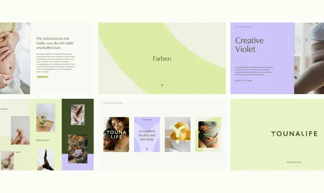
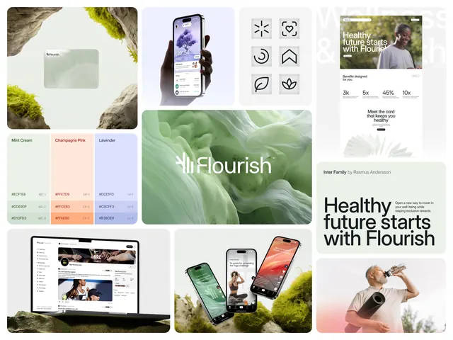
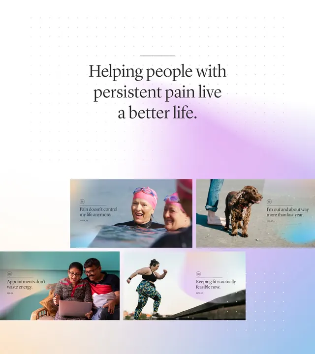
A cohesive wellness brand identity using soft lime and lavender tones paired with clean German typography and lifestyle photography.
Summary
A cohesive wellness brand system pairing soft lime and lavender blocks with lifestyle photography and clean sans-serif type, emphasizing natural, self-care values.
Visual description
The composition is structured as a multi-panel grid showing brand elements across pages. Top tier features three horizontal sections: left has cropped hands-on-skin photography with German copy about love and care; center is a large lime-green organic shape with the word "Farben" (Colors); right displays lavender background with serif headline "Creative Violet" and body text. Bottom section shows a moodboard grid mixing lifestyle photography (hands, plants, interiors) with color swatches in pastel lime and soft purple, anchored by the YounaLife wordmark. All photography is close, tactile, and warm-toned. Typography is modern sans-serif for body text and serif display type for headlines. White space separates each element cleanly.
Key takeaway
The pairing of soft, analogous pastels with organic shapes rather than hard geometry, creating calm without feeling cold. The use of cropped, intimate product-lifestyle photography paired side-by-side with large color-field shapes to communicate brand personality. The deliberate mix of serif headlines and sans-serif body copy for hierarchy.
Reuse notes
Ideal for wellness, beauty, healthcare, and self-care brands targeting female-skewing audiences. The palette and photography style work well for maternity, skincare, and organic product lines. Use this approach when you want clean, modern, and trustworthy without corporate sterility.
More like this

Keep what you find
A free account saves references to boards and can send you a weekly email of picks based on what you save.
To see every result, go Pro.