Preview image. Unlock full-res
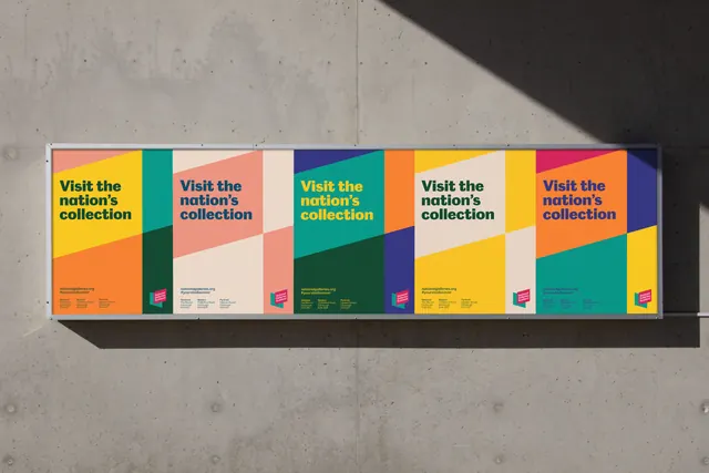
Five identical vertical promotional banners for a nation's museum collection, each with a unique vibrant color-block layout and rotated composition, creating visual diversity while maintaining modular structure.
Summary
Five consecutive exhibition banners for a museum series, each repeating "Visit the nation's collection" in large sans-serif across a unique diagonal color-block composition, rotating through orange, teal, pink, yellow, and purple palettes.
Visual description
A horizontal panoramic view of five adjacent vertical rectangular banners mounted on concrete. Each banner follows the same structure: a bold diagonal or angled division splitting the rectangle into two or three color zones. The headline "Visit the nation's collection" appears in dark sans-serif (caps or mixed case) positioned in the upper third, rotated to align with the banner's color angle. A small museum logo (pink/magenta rectangular mark) sits bottom-left of each. The color schemes shift across the sequence: banner 1 is orange-teal, banner 2 pink-teal, banner 3 teal-yellow, banner 4 cream-yellow-dark-teal, banner 5 orange-purple. Some panels are solid color; others introduce darker or lighter tints of the primary hue.
Key takeaway
A modular system where identical typography and composition can rotate through different color blocking without losing brand coherence. The diagonal angle treatment adds energy to what could be a static layout. Repeating the same message across five distinct color variations suggests variety while building message repetition.
Reuse notes
Ideal for museum, gallery, or cultural institution campaigns requiring high visual impact and legibility in an outdoor setting. The system works when placed sequentially (transit shelter, exhibition corridor); single banners lose their strength. Requires quality color printing and careful alignment of typography to the angled divisions.
More like this






Keep what you find
A free account saves references to boards and can send you a weekly email of picks based on what you save.
To see every result, go Pro.