Preview image. Unlock full-res
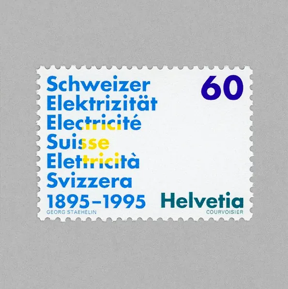
A vintage Swiss postage stamp design with stacked multilingual text celebrating 100 years of electricity, rendered in structured blue sans-serif on white with perforated edges.
Summary
A Swiss postage stamp commemorating 100 years of electricity, featuring stacked multilingual text (German, French, Italian) in crisp sans-serif against a white background with postal perforations and a large denomination numeral.
Visual description
White rectangular stamp with perforated edge borders typical of philatelic design. The layout is rigidly structured with four horizontal text blocks in royal blue sans-serif, reading "Schweizer Elektrizitat," "Electricite," "Elettricia," and "Svizzera" stacked vertically, followed by "1895-1995" and "Helvetia" at the base. A large purple numeral "60" occupies the upper right corner. The typography is clean and institutional, using uniform letter spacing and weight. Gray shadow or background tones provide subtle dimensionality. The overall composition is formal and archival, typical of Swiss utility design and official government commemoratives.
Key takeaway
The efficiency of stacked multilingual text in a fixed typographic hierarchy (name, translation, date, value) and the use of color restraint (one accent blue plus gray and white) for official clarity. The stamp's structured grid approach to information hierarchy is a masterclass in utility design.
Reuse notes
Ideal for institutional, governmental, or historical branding. The Swiss sans-serif style and color restraint translate well to packaging, certificates, and formal documentation. Works best when conveying official status, historical significance, or multilingual messaging. Not suitable for playful or casual contexts.
More like this


Keep what you find
A free account saves references to boards and can send you a weekly email of picks based on what you save.
To see every result, go Pro.