Preview image. Unlock full-res
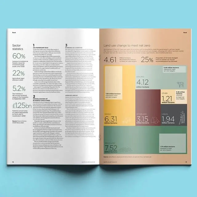
Two-page corporate sustainability or environmental report layout combining analytical percentages on the left with a colored data visualization grid on the right, unified by a cool teal and neutral palette.
Summary
A corporate policy or sustainability report spread balancing analytical sector statistics on the left against a multi-colored data grid on the right, anchored by teal accents and a cool, neutral palette.
Visual description
The left page presents "Sector analysis" as a header, followed by large percentage callouts (60%, 22%, 52%) in sans-serif, each paired with a brief explanatory paragraph in smaller type. A financial metric (1.25bn) is displayed at display scale. The right page titled "Land use change to meet net-zero" organizes numeric findings in a 3x4 grid of colored boxes, each containing a large stat (4.61, 25%, 4.12 million hectares, etc.) with a small label beneath. The colored boxes employ warm backgrounds (tan, wheat, olive, rose) to differentiate regions or categories. Throughout, the layout uses generous white space, light gray dividers, and a teal-blue accent band. Sans-serif typography maintains consistent hierarchy and readability across both pages.
Key takeaway
The split-page strategy of presenting analytical data (left) alongside categorical visualization (right) for balanced narrative and overview. The colored stat boxes as a lightweight, data-honest alternative to charts or infographics. Teal accents applied sparingly but consistently to guide the reader's eye without overwhelming the cool, credible tone.
Reuse notes
Ideal for corporate, nonprofit, or policy-driven publications reporting on sustainability, impact, or sector analysis. The two-column structure works well for print spreads and large-format digital reports. The color-coded stat boxes are particularly effective when categories naturally align with regions, industries, or initiatives. The restrained warm palette against cool neutrals creates visual interest without sacrificing authority.
More like this


Keep what you find
A free account saves references to boards and can send you a weekly email of picks based on what you save.
To see every result, go Pro.