Preview image. Unlock full-res
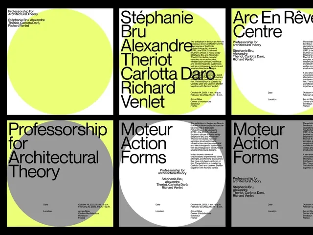
Trio of editorial publication covers with contrasting neon-yellow and dark gray-white color blocks featuring bold typography.
Summary
A set of three publication covers employing bold color-blocking with neon-yellow geometric shapes against white and dark gray backgrounds, with stacked sans-serif typography as primary visual content.
Visual description
Three rectangular cover layouts side by side. The left cover features a large neon-yellow rectangle containing stacked black sans-serif text (names and publication title). The center and right covers use large gray and white background areas with smaller white and gray zones, creating geometric division. Black sans-serif type (all-caps and mixed case) dominates each cover, sized to occupy 40-60% of the total area. Text alignment is left-justified or centered, with careful spacing. The neon-yellow is the only non-neutral color, appearing as a bold accent shape rather than distributed color. Each cover is self-contained yet the trio demonstrates a cohesive design system.
Key takeaway
Neon-yellow as a single accent color against a monochrome base creates impact without chaos. Color-blocking with geometric precision (not organic shapes) conveys editorial authority. Typography treated as graphic shape, not just labeling. The consistency across covers through the shared color and type treatment demonstrates how systems scale across multiple compositions.
Reuse notes
Strong for editorial design, academic publishing, and design-focused magazines. The high contrast and bold type ensure readability in digital and print. The neon-yellow should remain reserved as accent only; if applied across multiple surfaces it loses impact. Works best paired with generous white space and strong hierarchy between primary (yellow block) and secondary (type) elements.
More like this



Keep what you find
A free account saves references to boards and can send you a weekly email of picks based on what you save.
To see every result, go Pro.